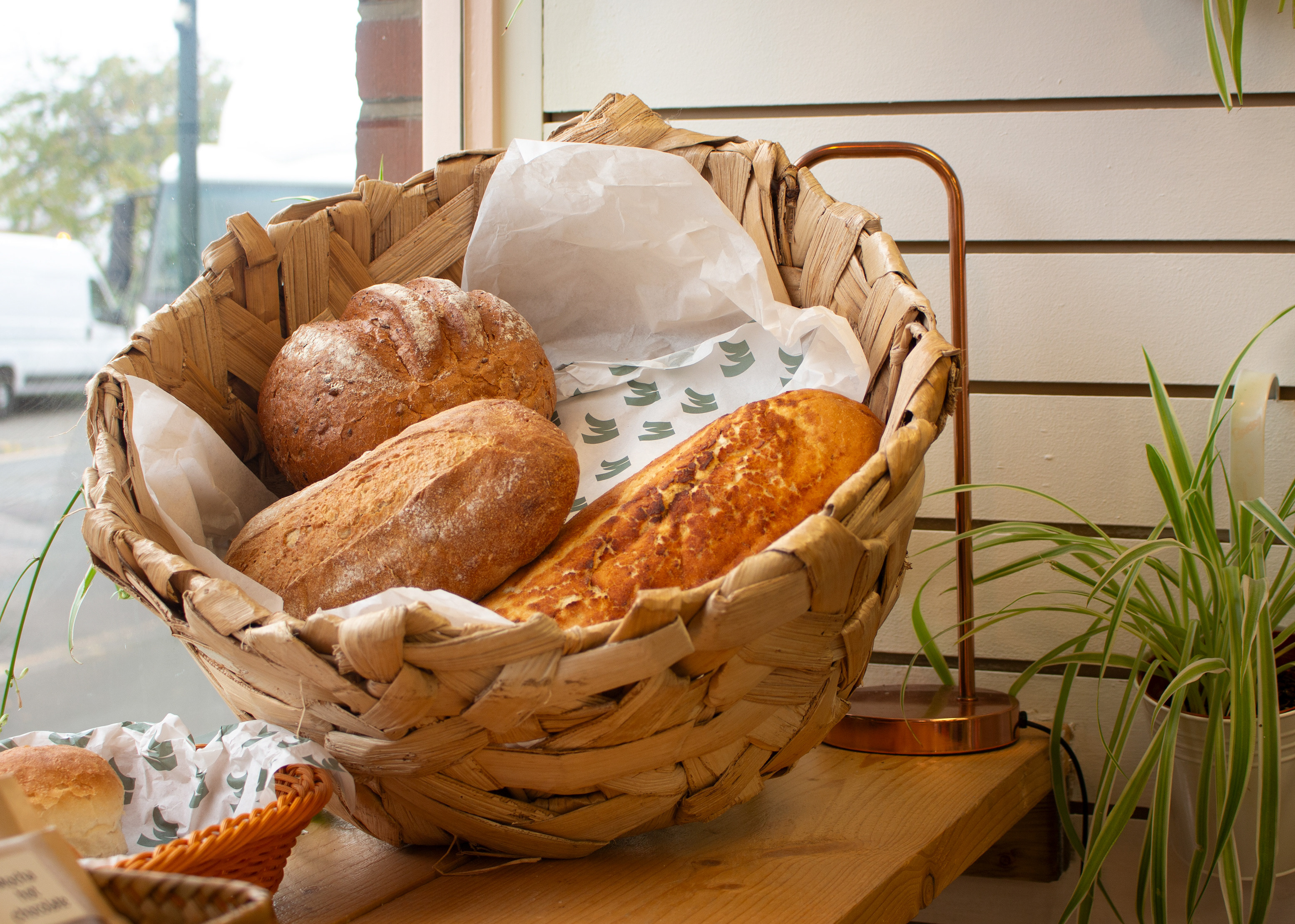
Since relocating to Bristol I have visited SO many amazing independent cafés, brewhouses and shops, so I thought... why not make my own! Based off a hypothetical brief, I have created the branding for a modern sourdough bakery (that probably also serves coffee of course).
Mock Ups


Logos & Brand Board
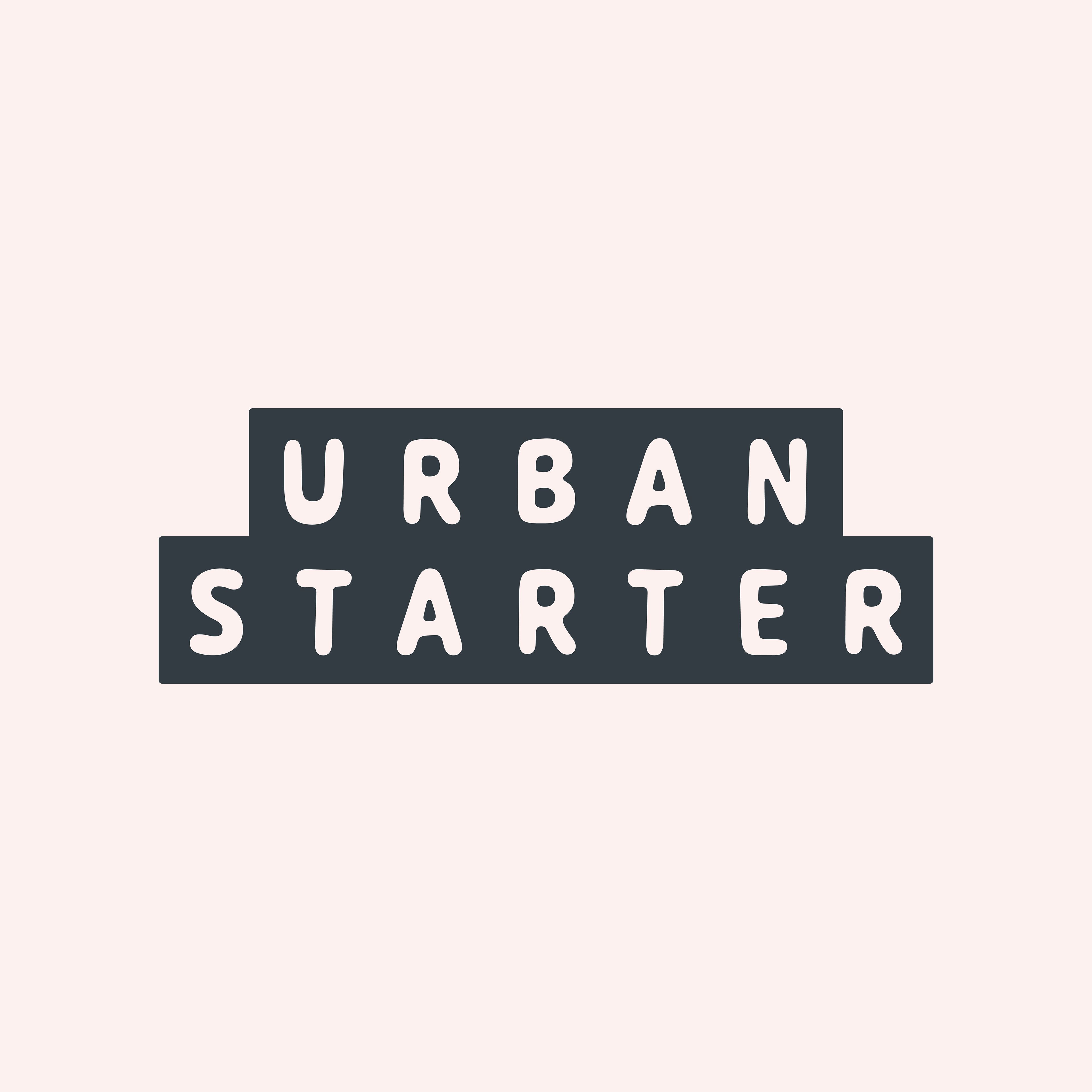
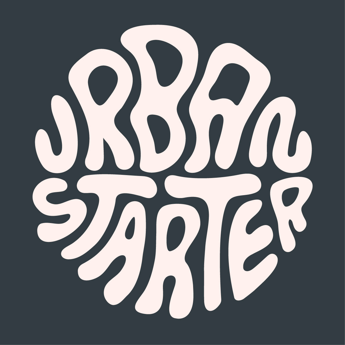
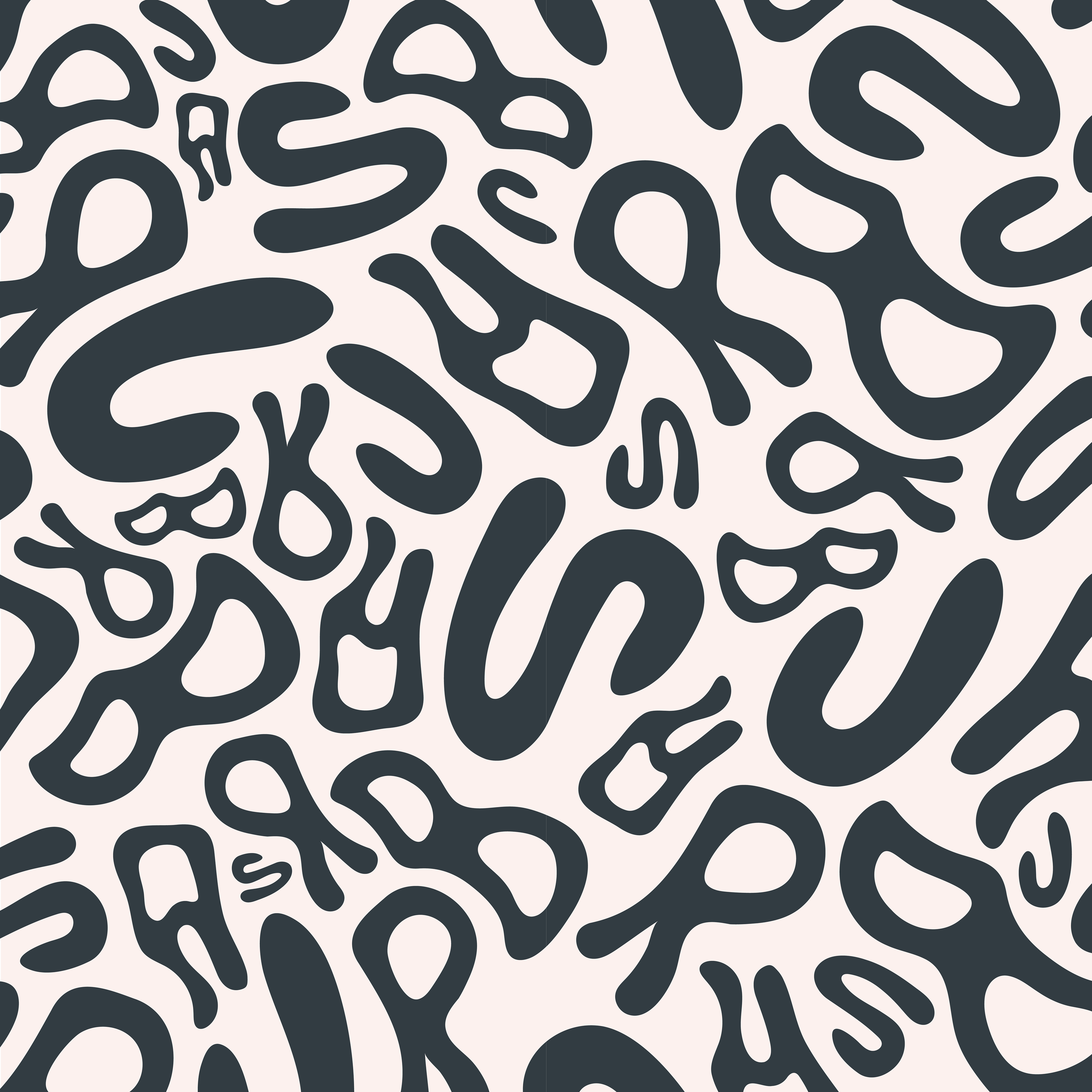
My aim with this project was to create the branding for a sourdough bakery with a cool, edgy feel. I wanted there to be something a bit Bristol about it. One of the main reasons I undertook this project was to push myself further out of my comfort zone and experiment with a less feminine design that would appeal to a wider range of audiences.
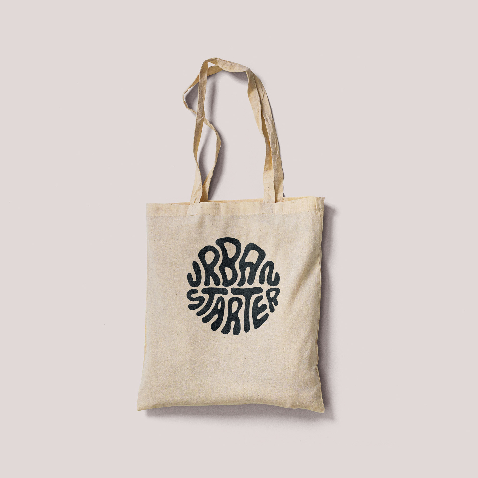
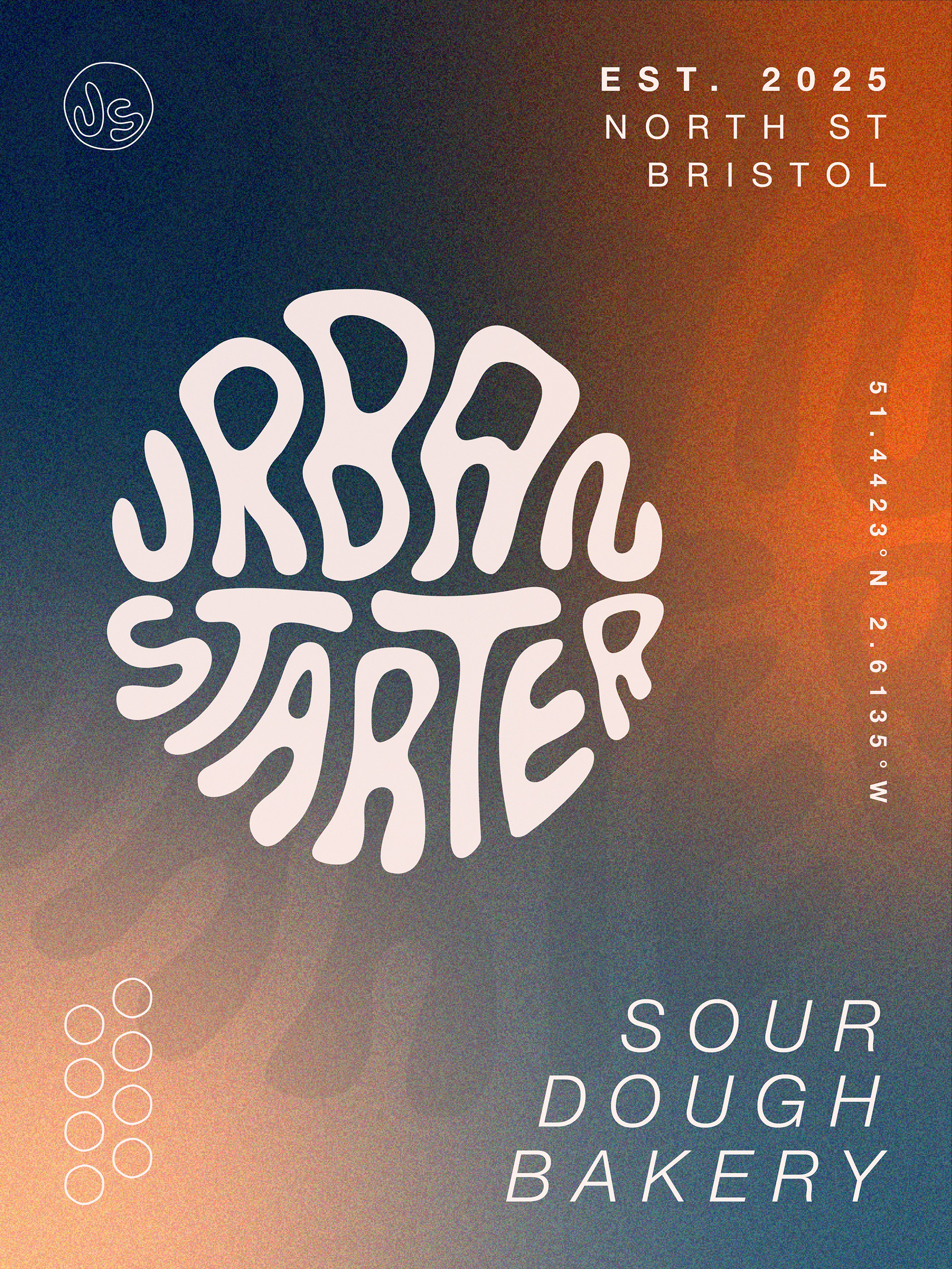
My favourite part of the branding is definitely the secondary logo and how it adds more of an artistic feel to the brand. It would be exciting to see where I could take this in the future with more merch designs and illustrations.
Design Process
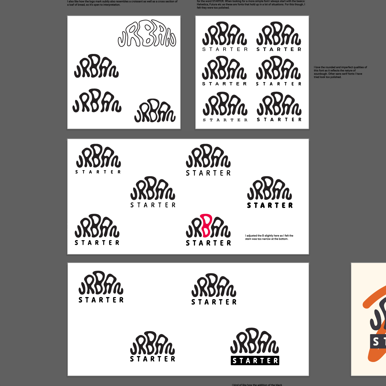
This project started off with a quick brainstorm of logo ideas to get everything on the page before choosing one idea to develop further. I did a mind map to visualise where I could go with the branding and elements I wanted to focus on within my designs. I wanted to reflect the qualities of sourdough and bread baking in the logo so I opted for some custom typography. Some things I was thinking about were fluidity, texture and the tactile element of the bread dough. After tracing the design in Illustrator, it took me a while to get the lettering perfect, but after going away and coming back to it and viewing it in different sizes, I decided I was happy with it. I also like how the logo subtly also resembles a croissant as well as a cross section of a loaf of bread, so it’s open to interpretation.
I then moved on to trialling fonts for the other half of the logo. I ended up choosing Caraque, a sans serif font with a 'melted' option which had a smooth, fluid like quality, fitting perfectly with the style I was going for. I then tested out different weights, sizes and spacing between letters, as well as the spacing of the words themselves until I was happy with it.
On a whim whilst I was trialling things, I highlighted 'STARTER' with a rectangle, which in the end helped visually balance the logo and take some of the weight off the top. I also like how this looked like it was made with a label maker, similar to labels you might find in home kitchens.
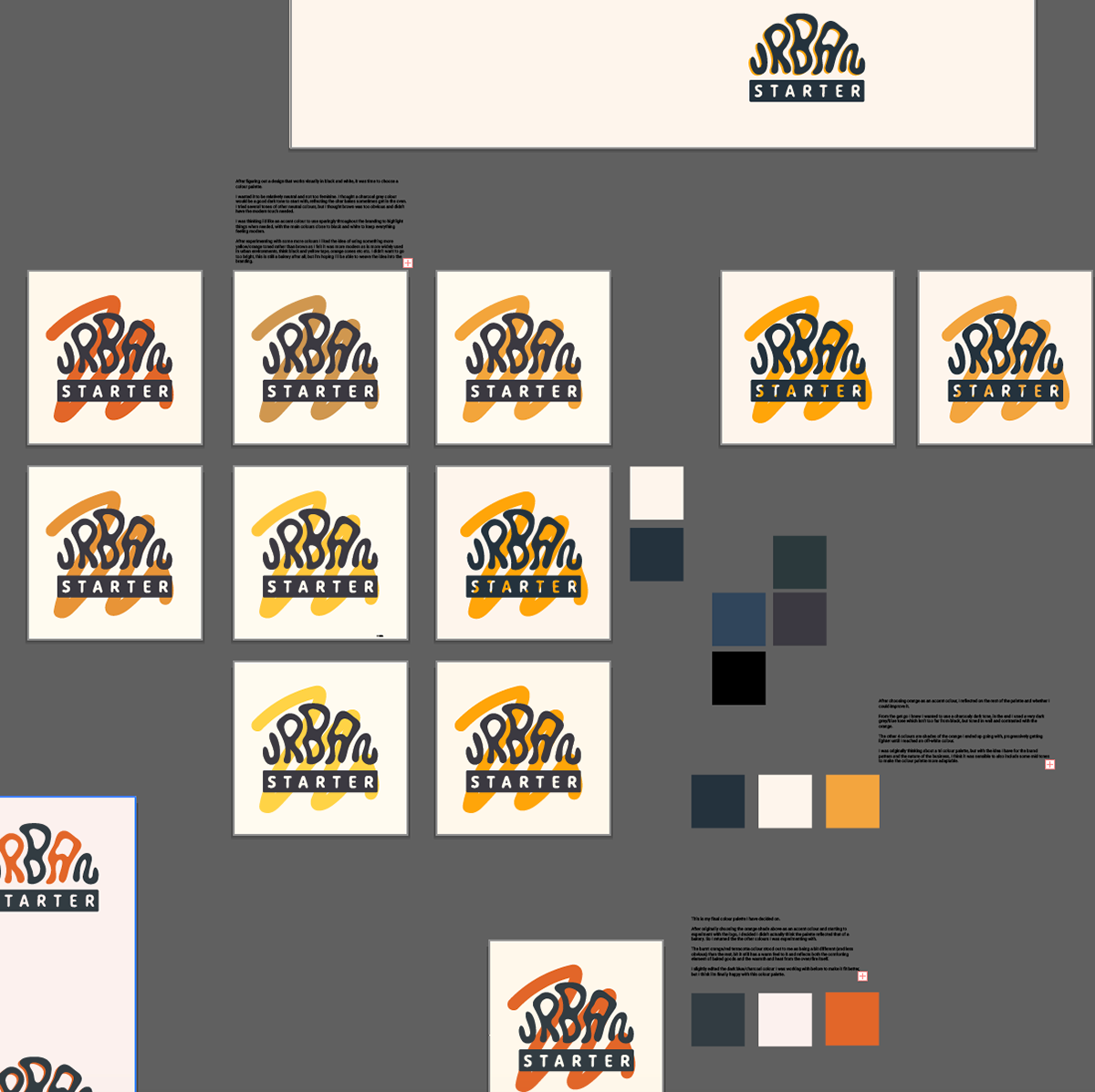
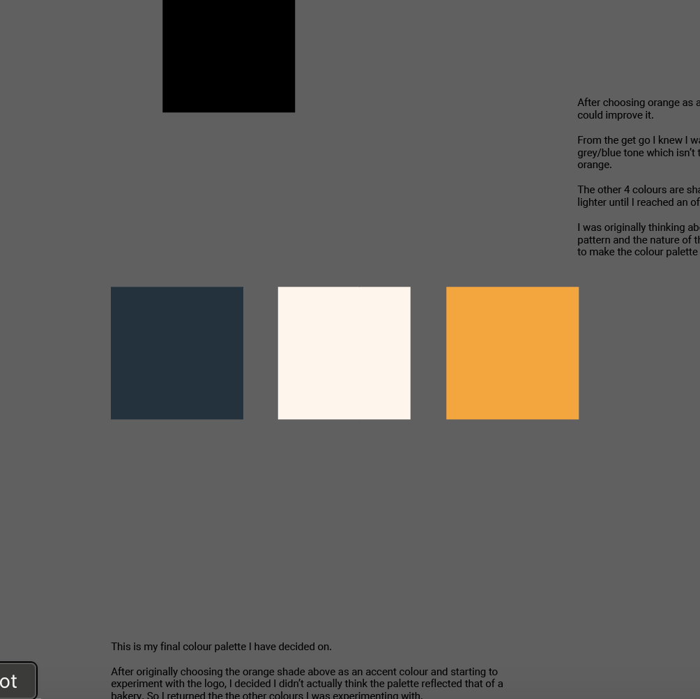
After figuring out a logo design that works well in monochrome, I moved on to think about adding colour. I wanted it to be relatively neutral and not too feminine. I thought a charcoal grey colour would be a good dark tone to start with, reflecting the char bakes sometimes get in the oven. I tried several tones of other neutral colours, but I thought brown was too obvious and didn’t have the modern touch needed. I was thinking i’d like an accent colour to use sparingly throughout the branding to highlight things when needed, with the main colours close to black and white to keep everything feeling modern. After experimenting with some more colours I liked the idea of using something more yellow/orange toned rather than brown as I felt it was more modern as is more widely used in urban environments, think black and yellow tape, orange cones etc etc. I didn’t want to go too bright, this is still a bakery after all, but i’m hoping I’ll be able to weave the idea into the branding.
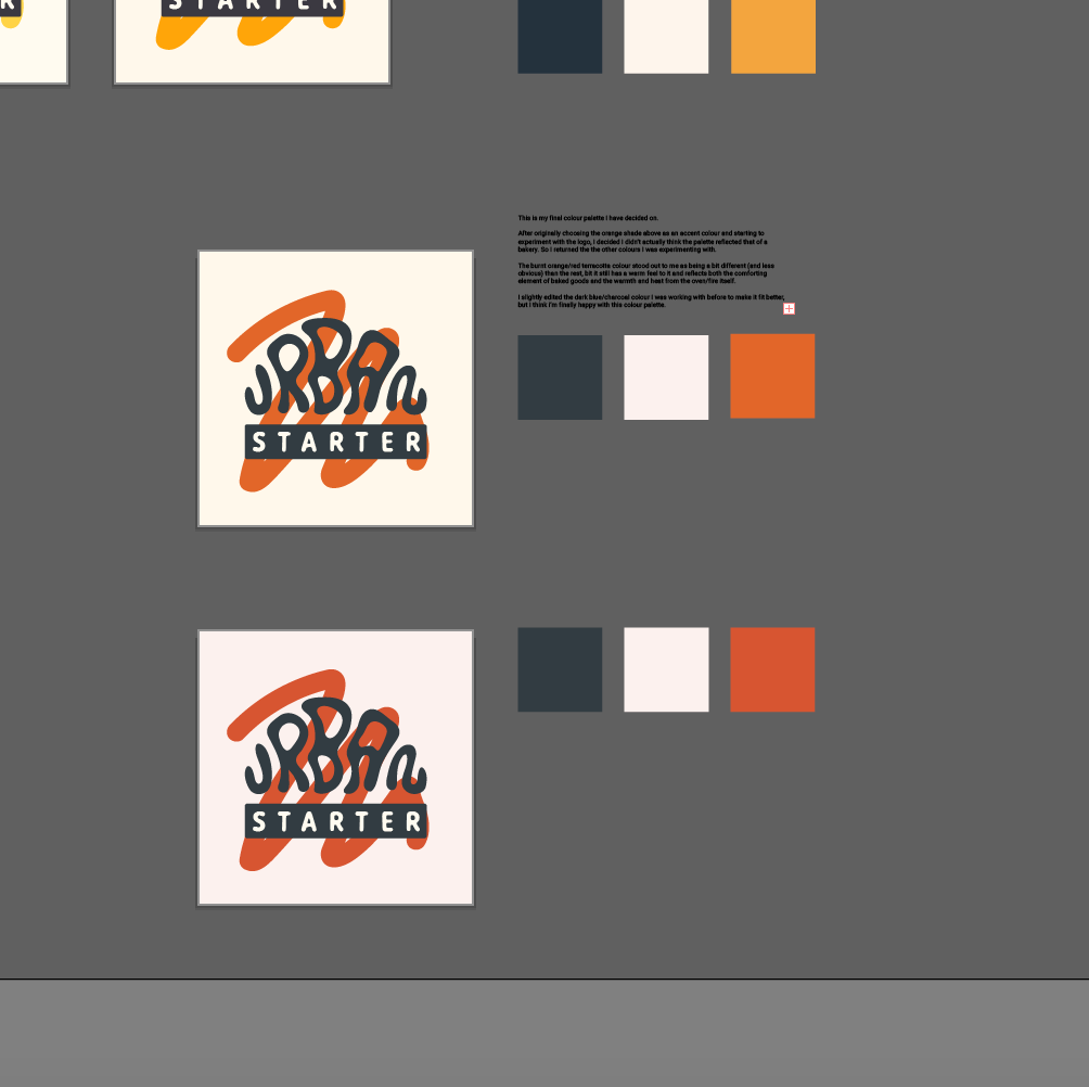
After choosing a shade of orange as an accent colour, I reflected on the rest of the palette and whether I could improve it. From the get go I knew I wanted to use a charcoaly dark tone, in the end I used a very dark grey/blue tone which isn’t too far from black, but toned in well and contrasted with the orange. I then started to experiment with the logo and how I could bring colour into it, but something wasn't sitting right with me about the colour palette. I ended up revisiting my choice and ended up going for the dark terracotta red, and adjusted the other shades accordingly.
As I continued my experimentation with colour and the logos I really started to question, does this design actually need any bright colours? In the end I decided... no it doesn't! I decided the dark and light shades speak well enough for themselves and I can develop the identity further through other means such as the pattern.
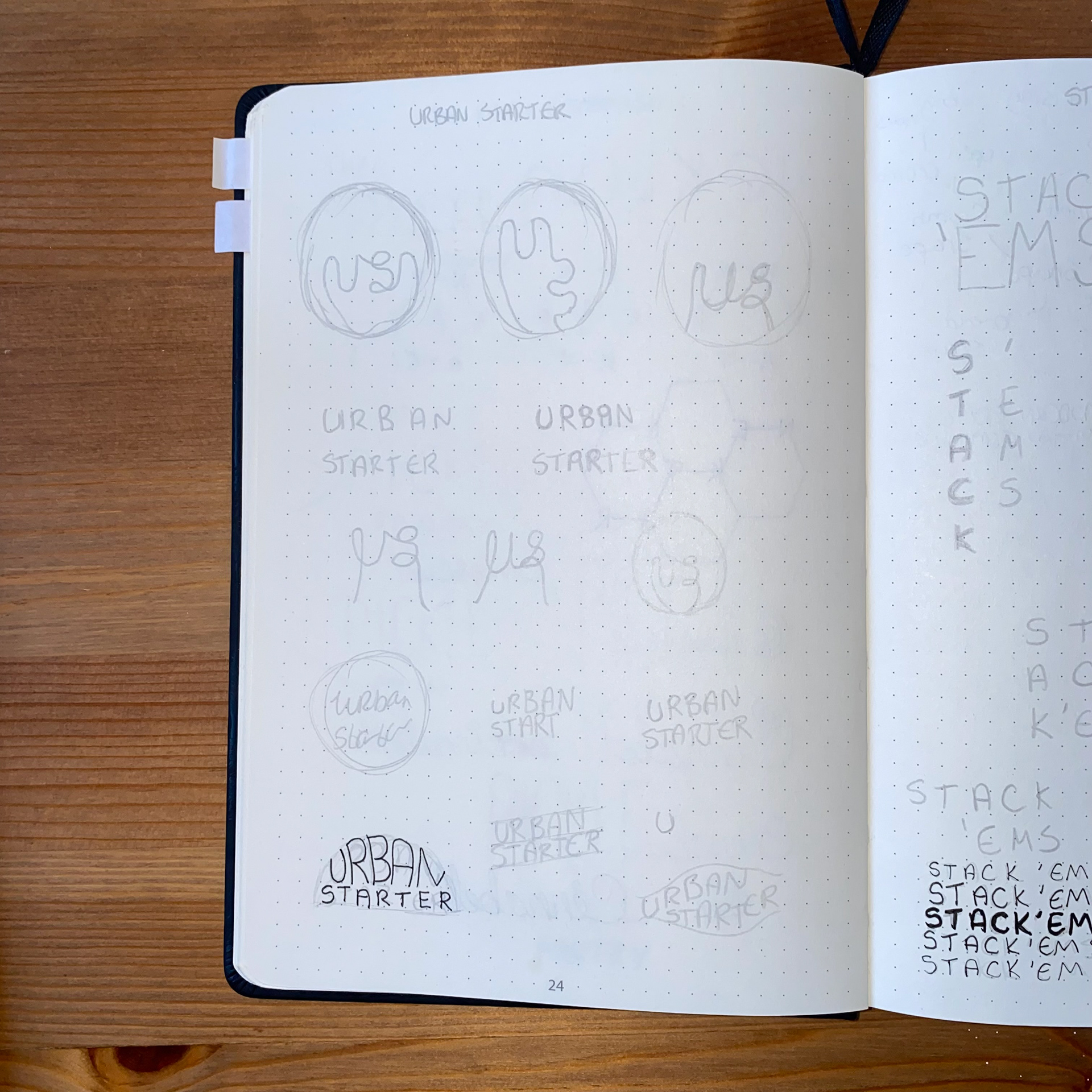
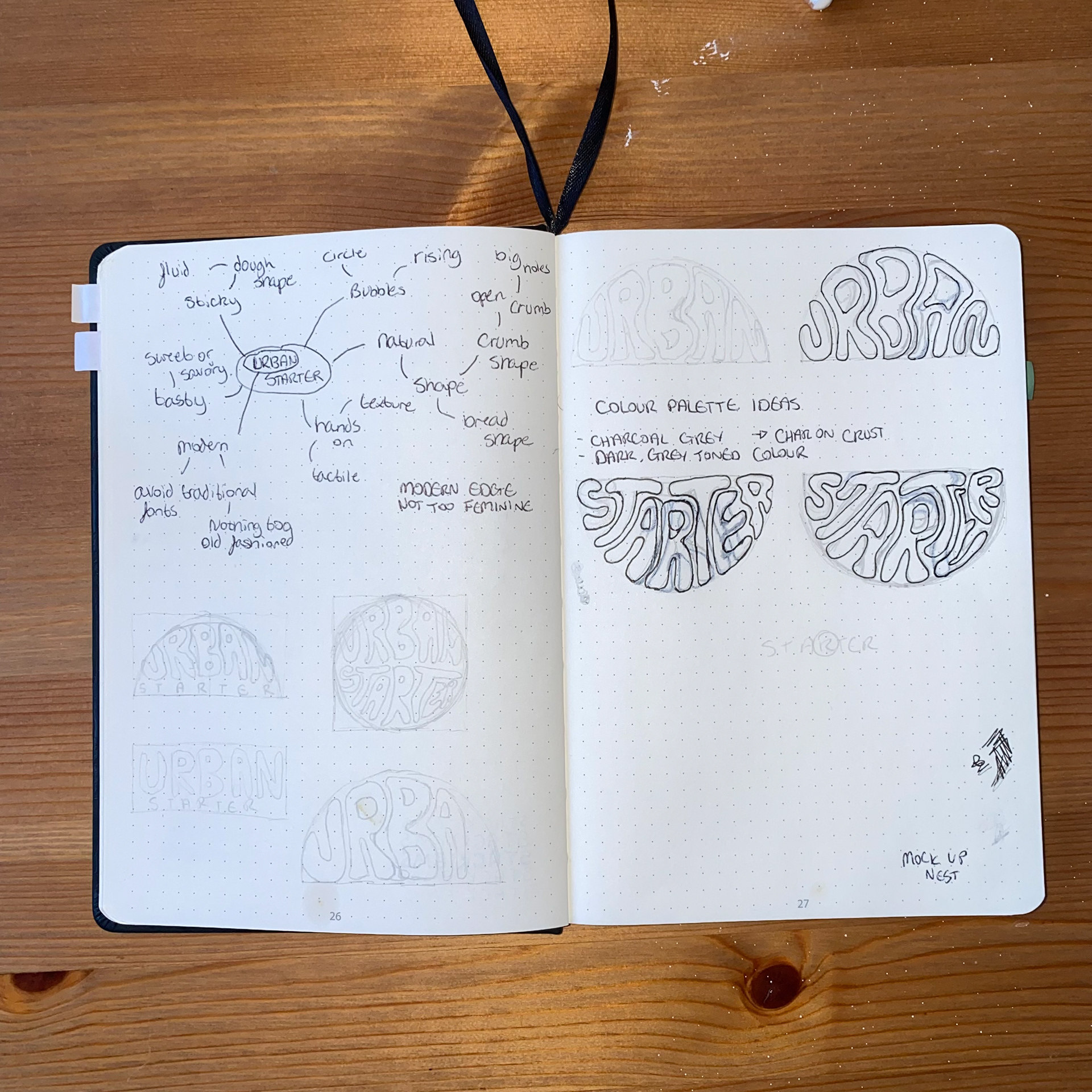
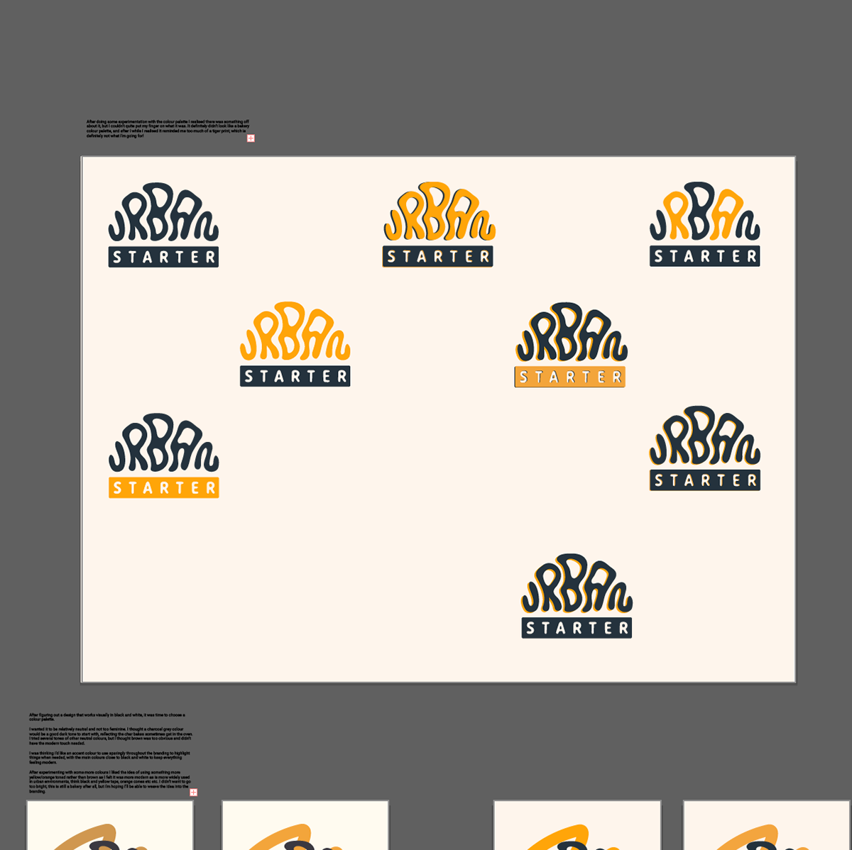
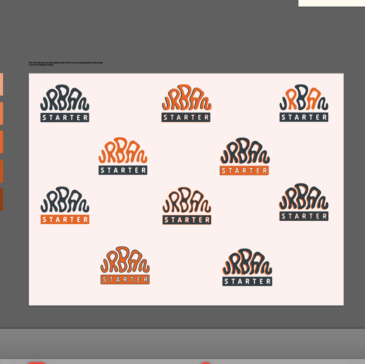
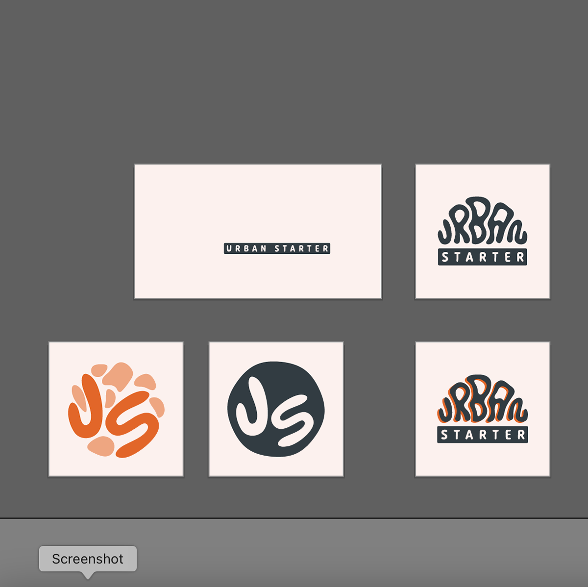
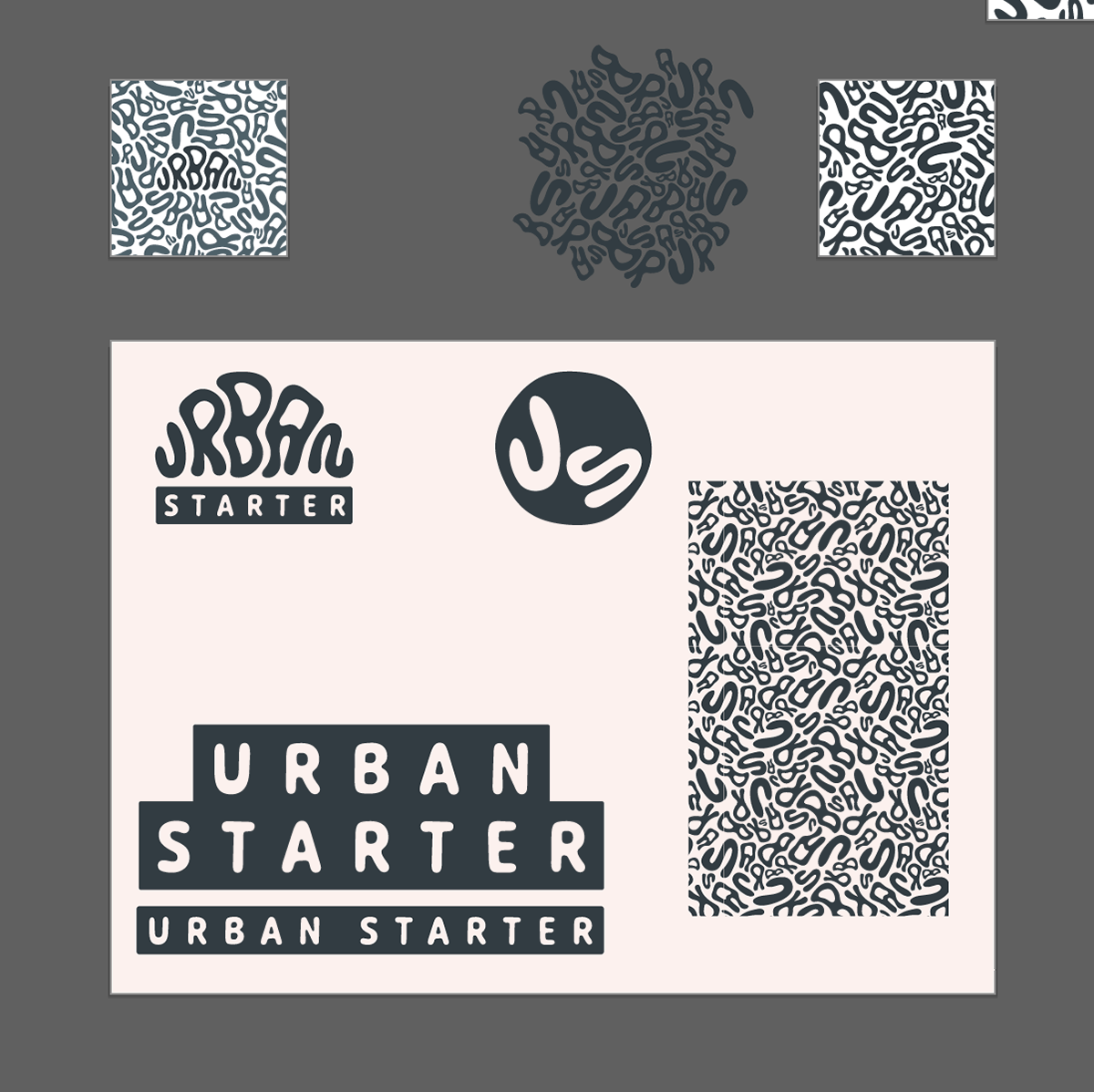
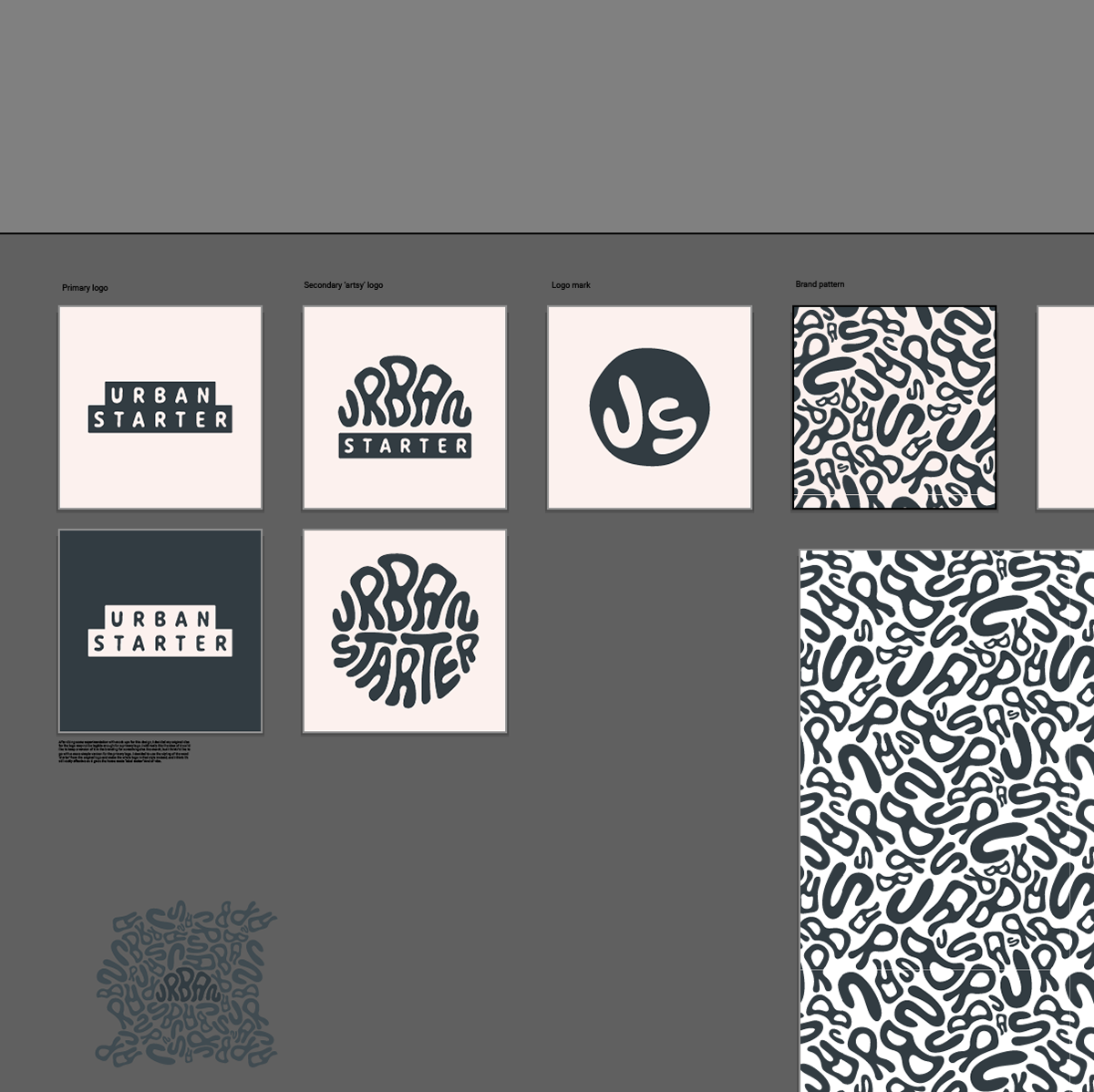
Next I started to experiment with different version of the logo and the brand pattern. I used the custom typography of the word 'URBAN' to create a seamless, fluid pattern reflecting the inside crumb structure of a loaf of sourdough. I liked how the style of this lettering can be interpreted in different ways, from the texture of bread dough to the bubble writing style of graffiti. It also kind of reminds me of the Paramore Riot! album cover too.
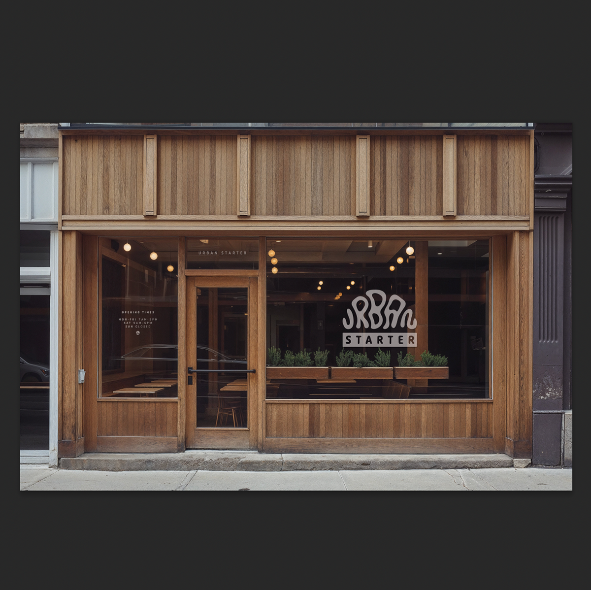
After I was happy with everything I'd done so far, I started to put together some mock-ups so I could visualise the brand in the real world. This is where I met my next hurdle of... is this design legible enough to be a primary logo? After debating for a while I decided, from a distance yes, close up, probably not. I decided to change the logo design to the 'label maker' style of 'STARTER', and it was much more readable both close up and from a distance. This style would be much more adaptable for things like menu boards or sandwich board adverts as well.
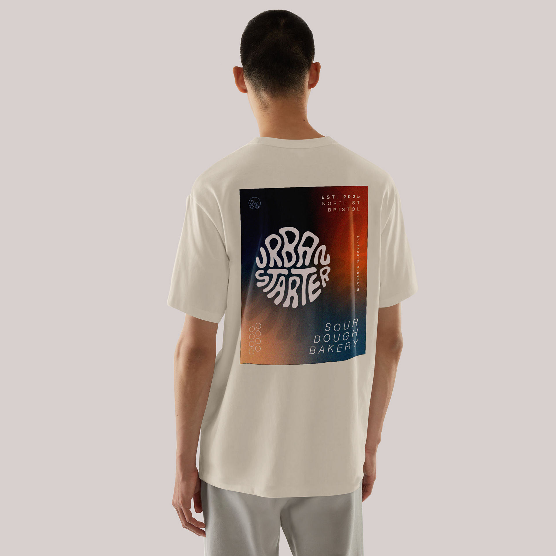
Although I had moved away from the bubble text idea, I still loved the concept and wanted to include it in the branding. I decided to use it as a secondary, more edgy logo that could be used for merch, stickers and more casual applications. I created the word 'starter' in the bubble text and went through the same process of refining that I did at the beginning. To test this out I created some merch mock-ups as well as a T shirt design. I love how these turned out, especially the stickers. I would love to experiment with more t shirt designs and create styles that would appeal to different audiences, as I feel the logo is quite adaptable in that way.
