As part of my mentorship with David Alexander, Creative Director of The Frameworks design agency, I undertook one of the ISTD (International Society of Typographic Designers) 2024 student briefs, which many design students take as part of their degree qualification.
My chosen brief was ‘Joybringer’, the aim being to bring to light something that brings you, or other people joy. Living by the sea, I decided to opt for wild swimming.
The full brief is available here: https://www.istd.org.uk/uploads/1696845927.0179/ISTD
Final Zine
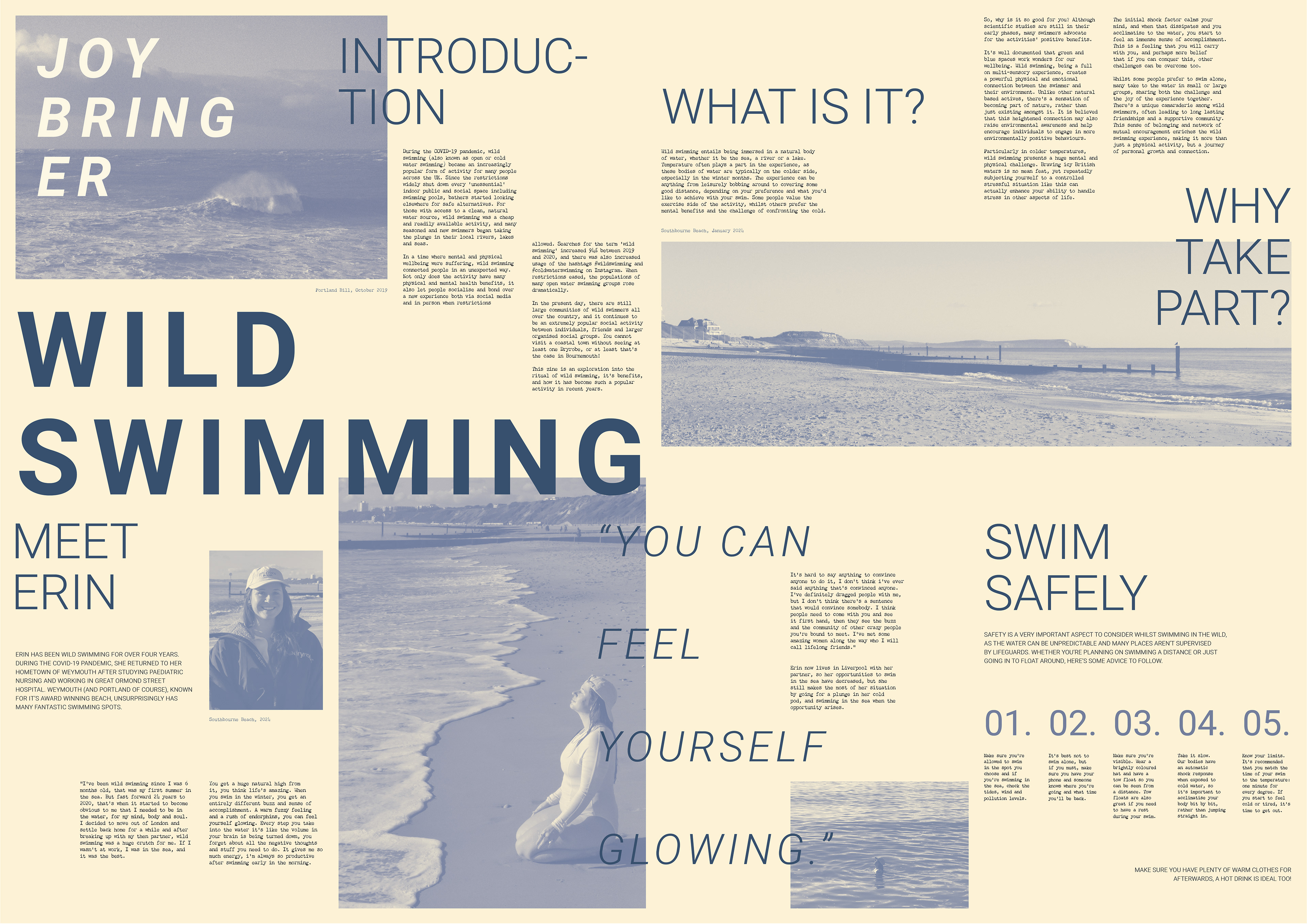

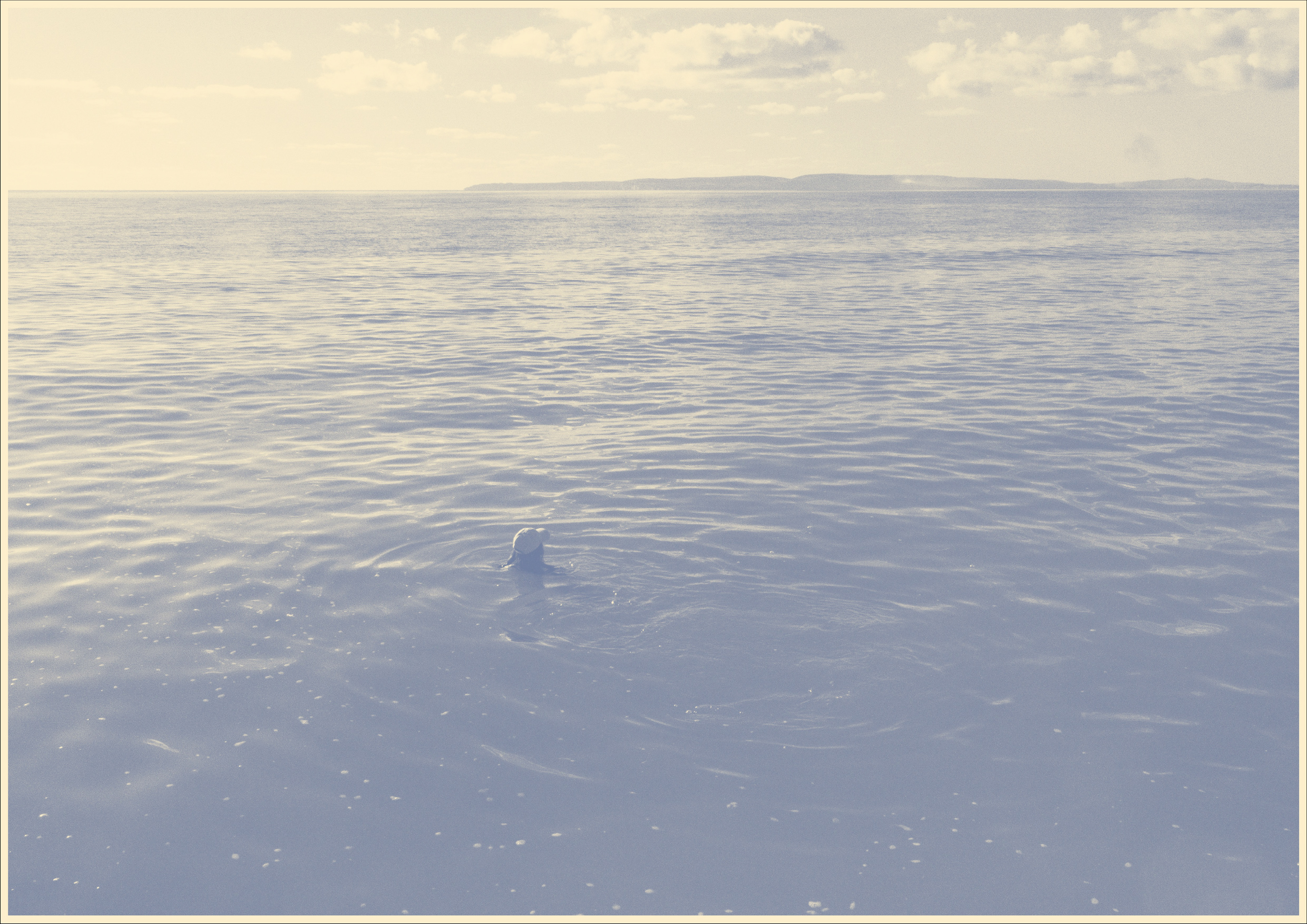
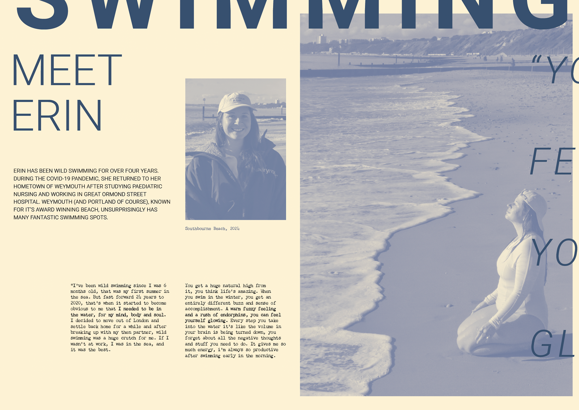
This project gave me an opportunity to utilise my photography skills as well as graphic design. I opted for an editorial, zine style publication, aimed at those interested in both art and wild swimming (and those needing a nudge to take the plunge!).
Physicality is a big part of the zine, I wanted to reflect the physical connection between the person and their environment. I wanted to create a sizeable piece, where the pages could be viewed individually, but it also unfolds to create a large single spread which reflect the vastness of the bodies of water.
The piece is also double sided and has a large art print on the back, which can be hung on a wall as a poster. I wanted to make the piece have long term function after the zine has been read.
Moving on to the aesthetic choices, I chose Roboto as the Title/Heading/Subheading font, and Chandler 42 Regular for the body copy. I love Roboto as a neutral Sans Serif which is highly legible, and has many variations to create different effects. Chandler 42 was a choice I made to add to the physicality and create a handcrafted effect.
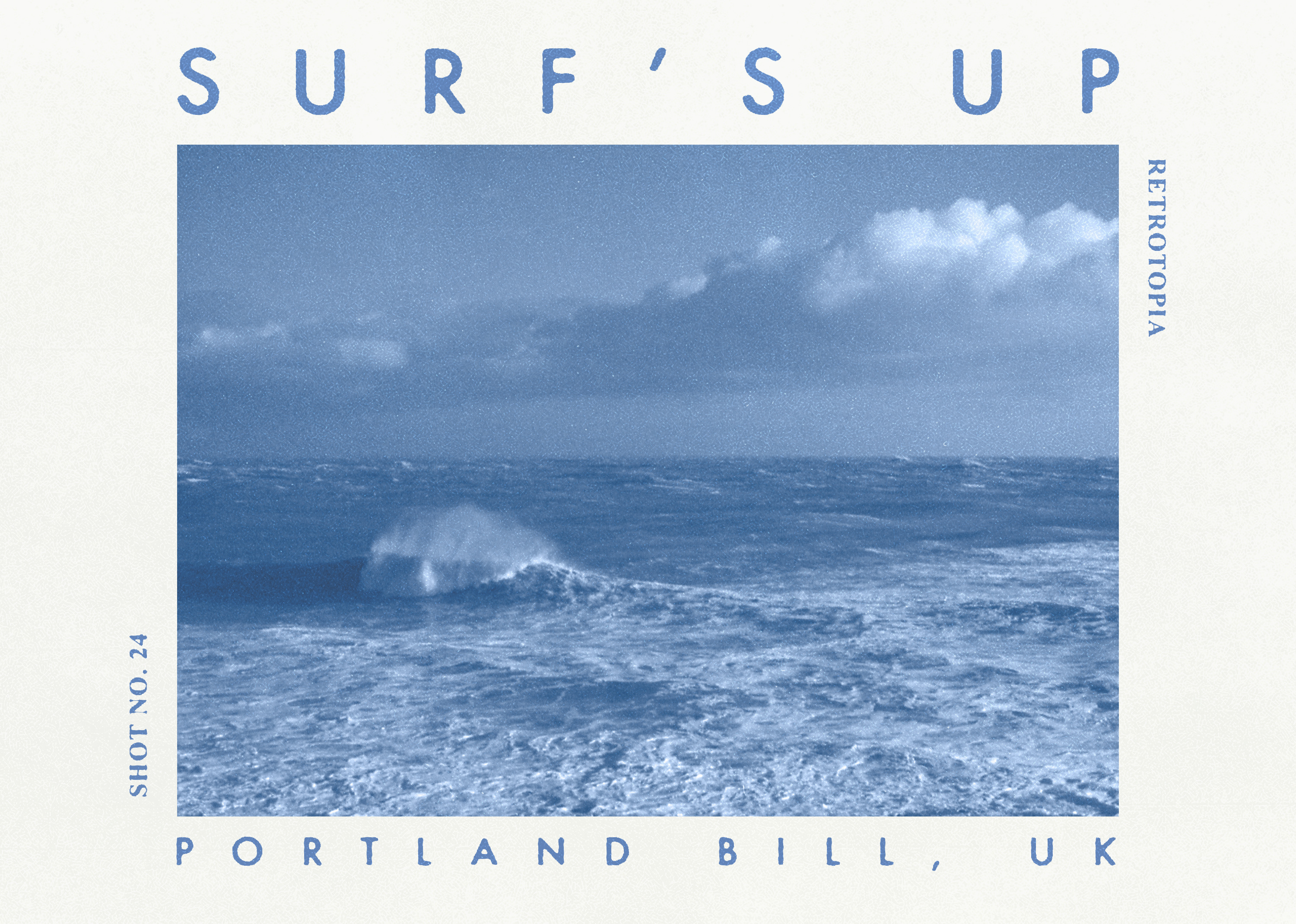
I wanted to keep the colour palette quite simple, so I went for a muted grey-blue and and cream colour for the background, as white was too harsh. I created monochromatic images that look almost screen printed, which again adds to the physical aspect of the piece. The simple colours put more emphasis on the content and composition of the images themselves as well as tying them in harmoniously with the rest of the design.
I’m currently looking at getting physical copies of the zine made. From the start I wanted to use newsprint paper, as I think it would create a textural experience that ties in with the work nicely. Unlike thick art and photographic paper, newsprint is meant to be touched and handled, so it wouldn’t make sense to print on anything else. The thickness of the newsprint will also add movement to the work, which is something other papers do not offer.
Readable version
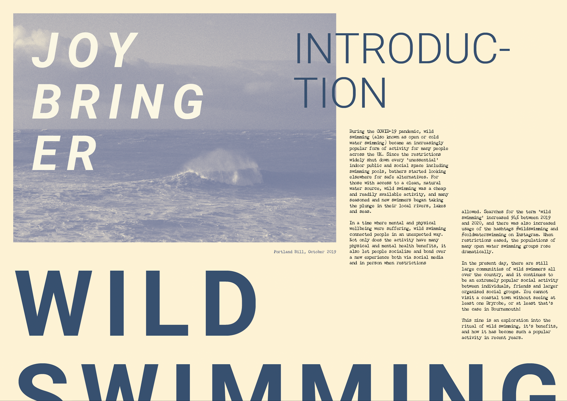

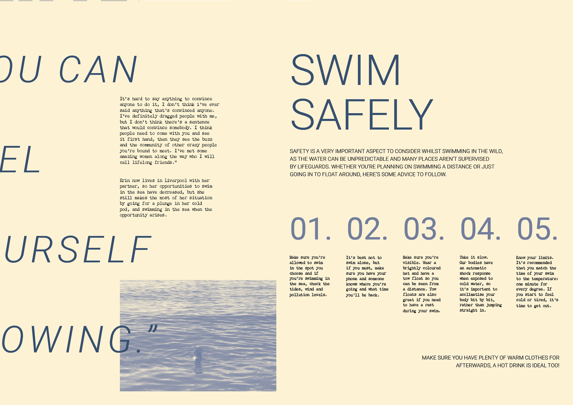
Creating a zine also offered the opportunity to practise copywriting, which is something I wanted to explore for career opportunities.
