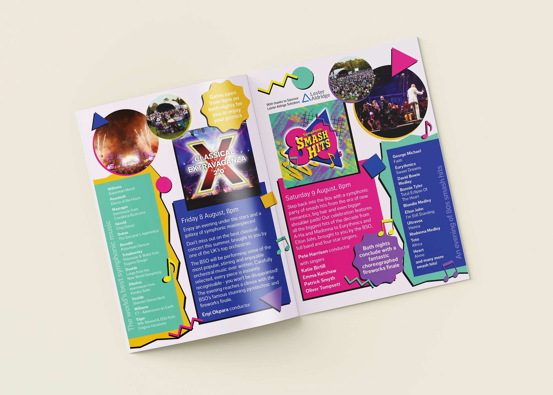
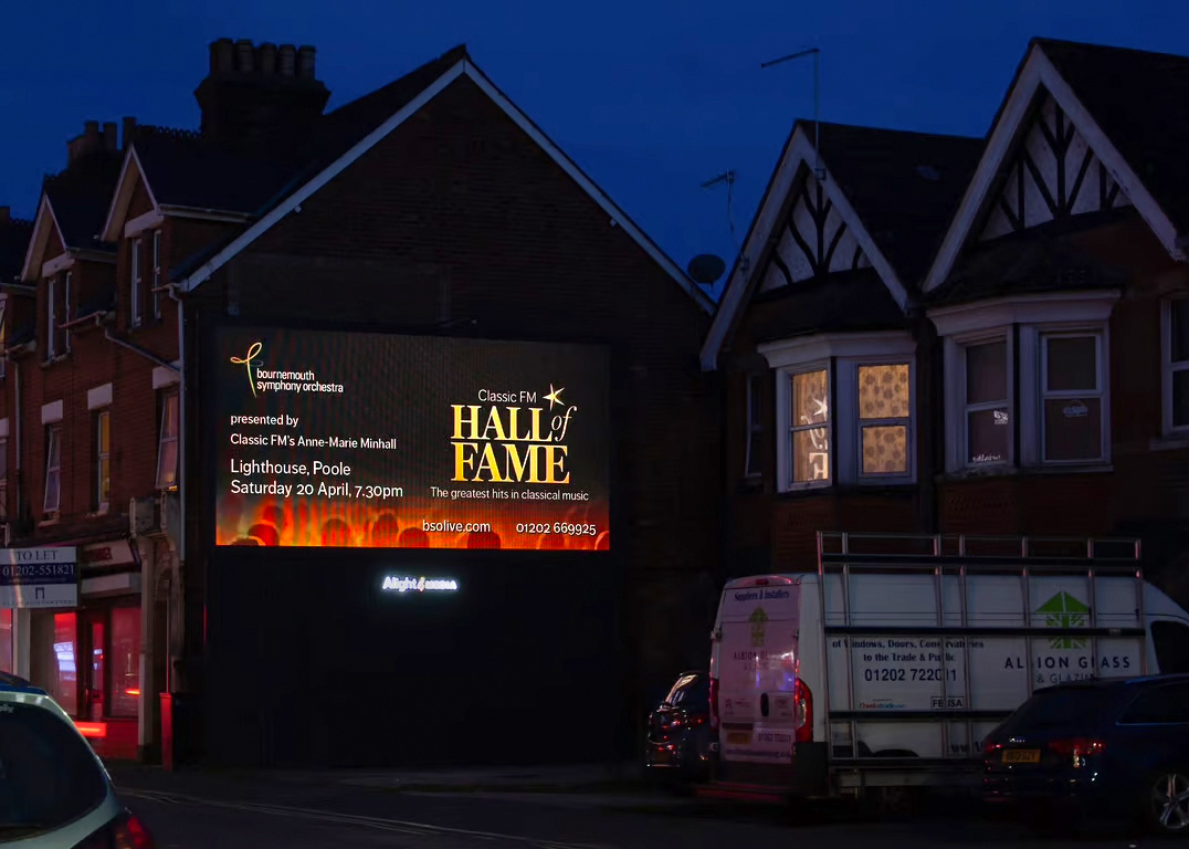
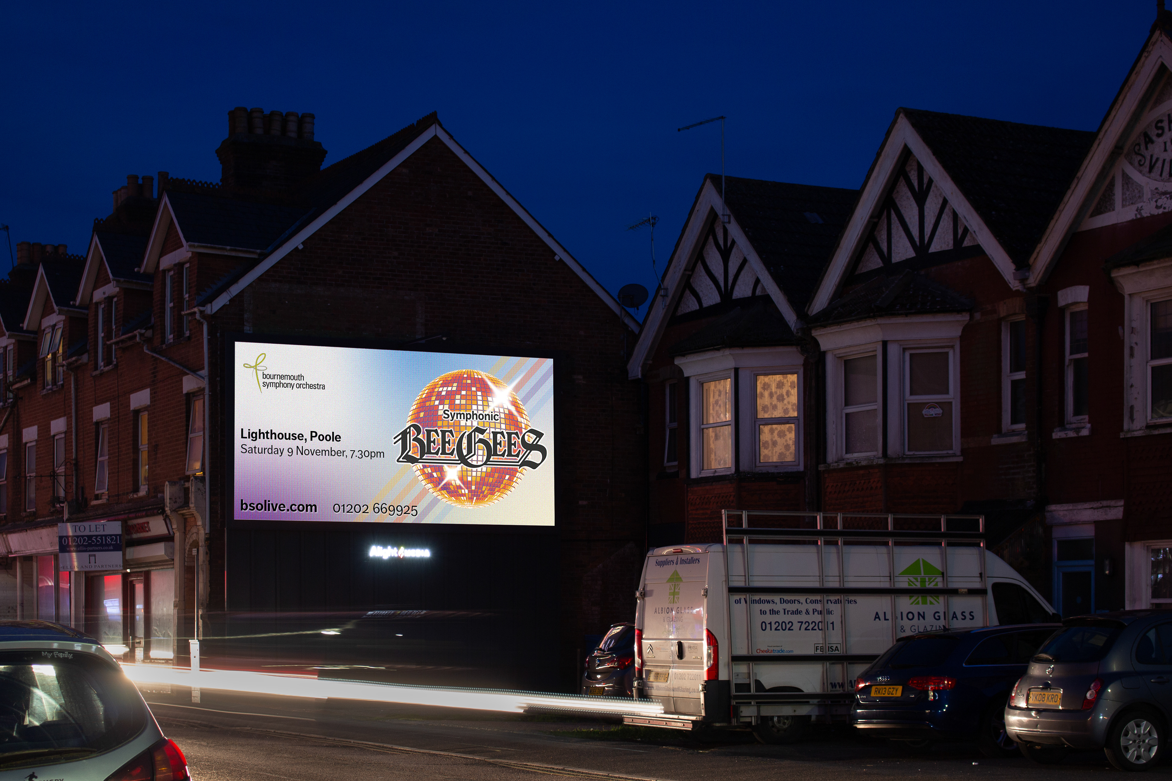
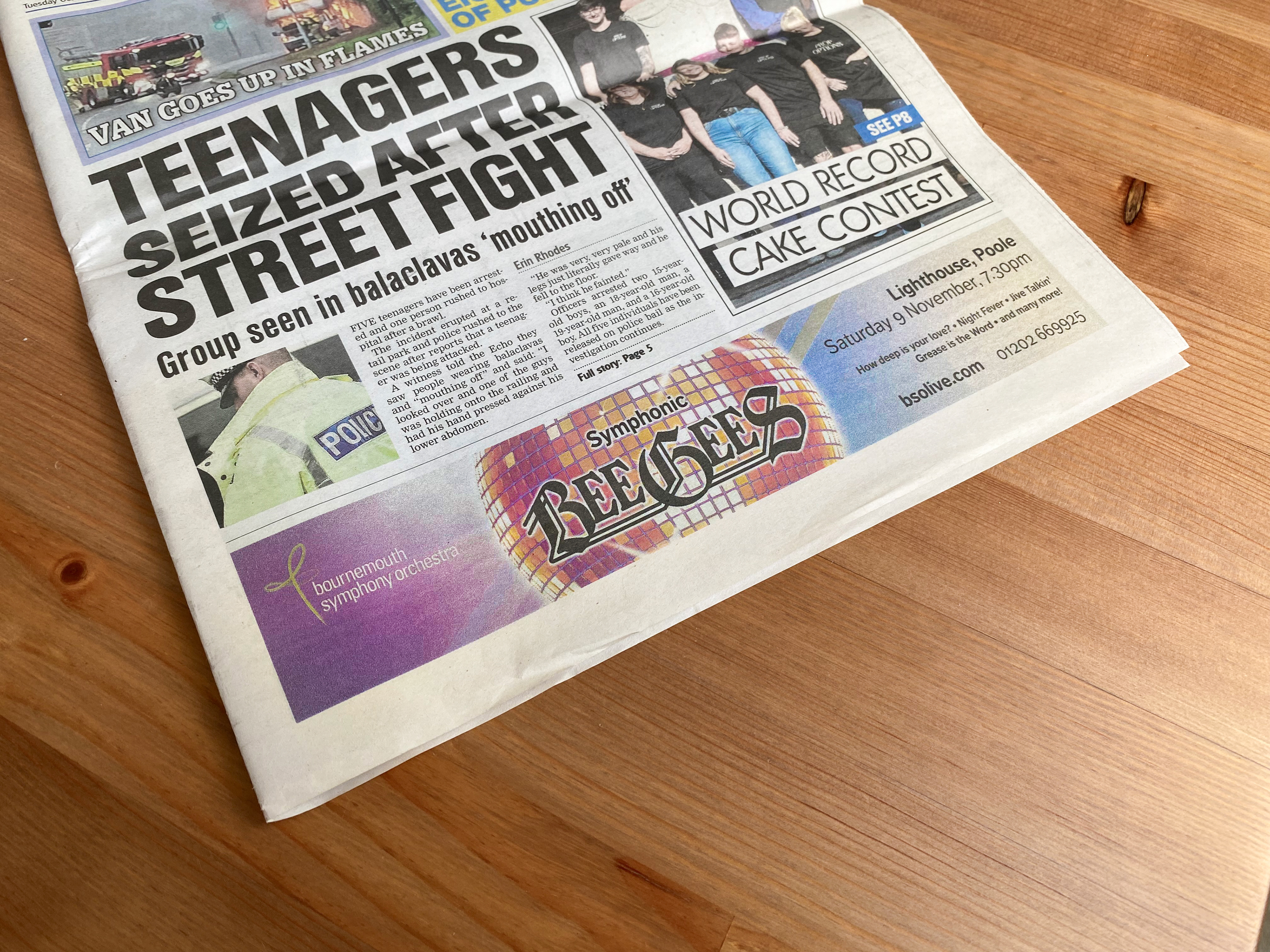
The brief for this project was to create 'brand' artwork for an upcoming BeeGees themed concert, which could be used as is or adapted for different outputs. To achieve this I had to create a versatile design that was constructed in a way which could be easily modified depending on the application.
This project was right up my street as I love retro aesthetics!
Artwork & Applications


Design Process
Mood Board
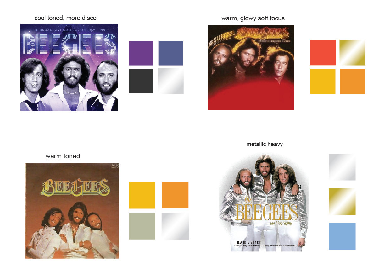
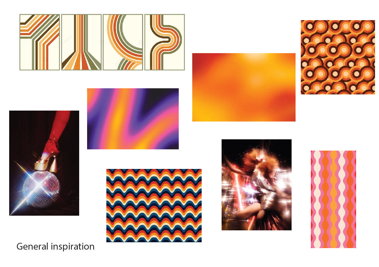
I always start my design process with research into the project i'm working on, alongside the brief i've been given. I collate my findings into a mood board which I send to the client to gauge which direction they would like to move forward in.
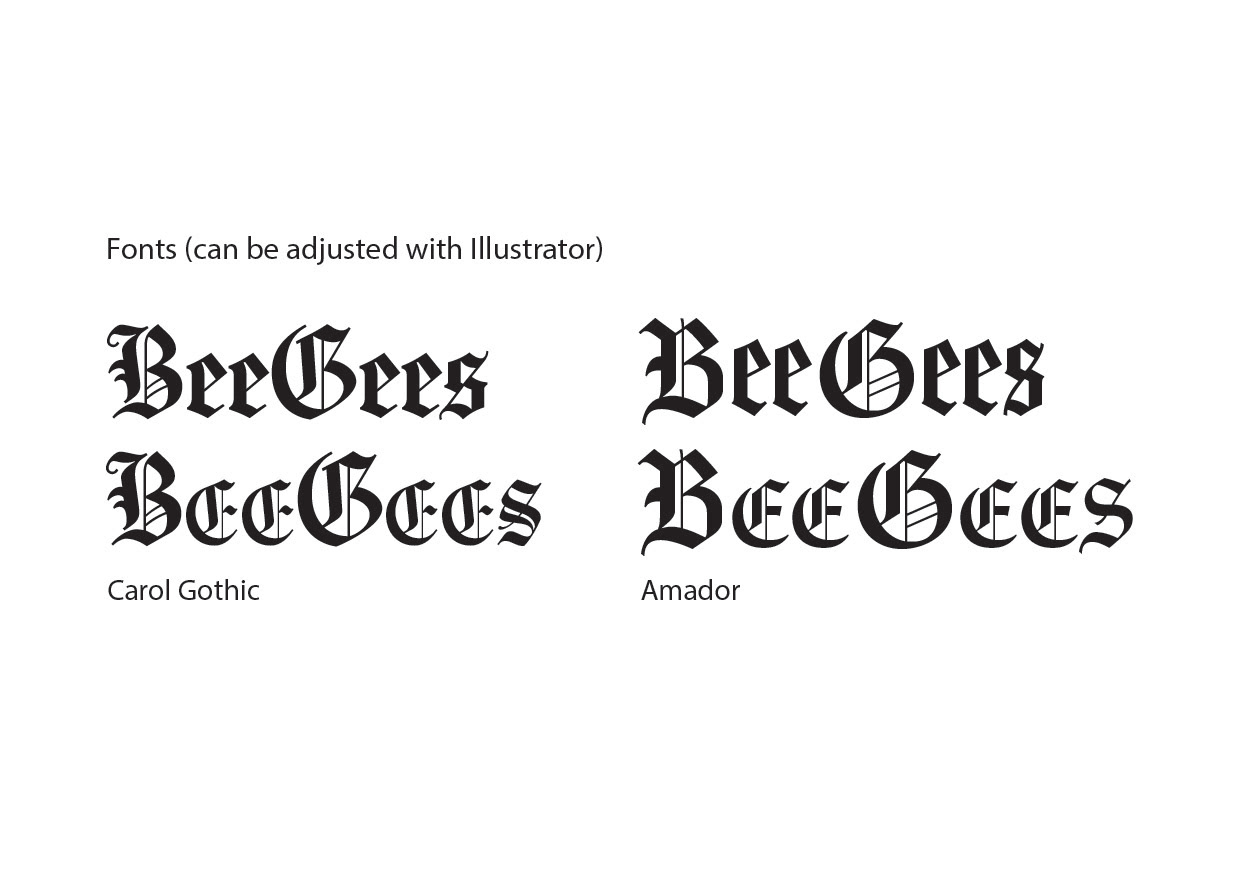
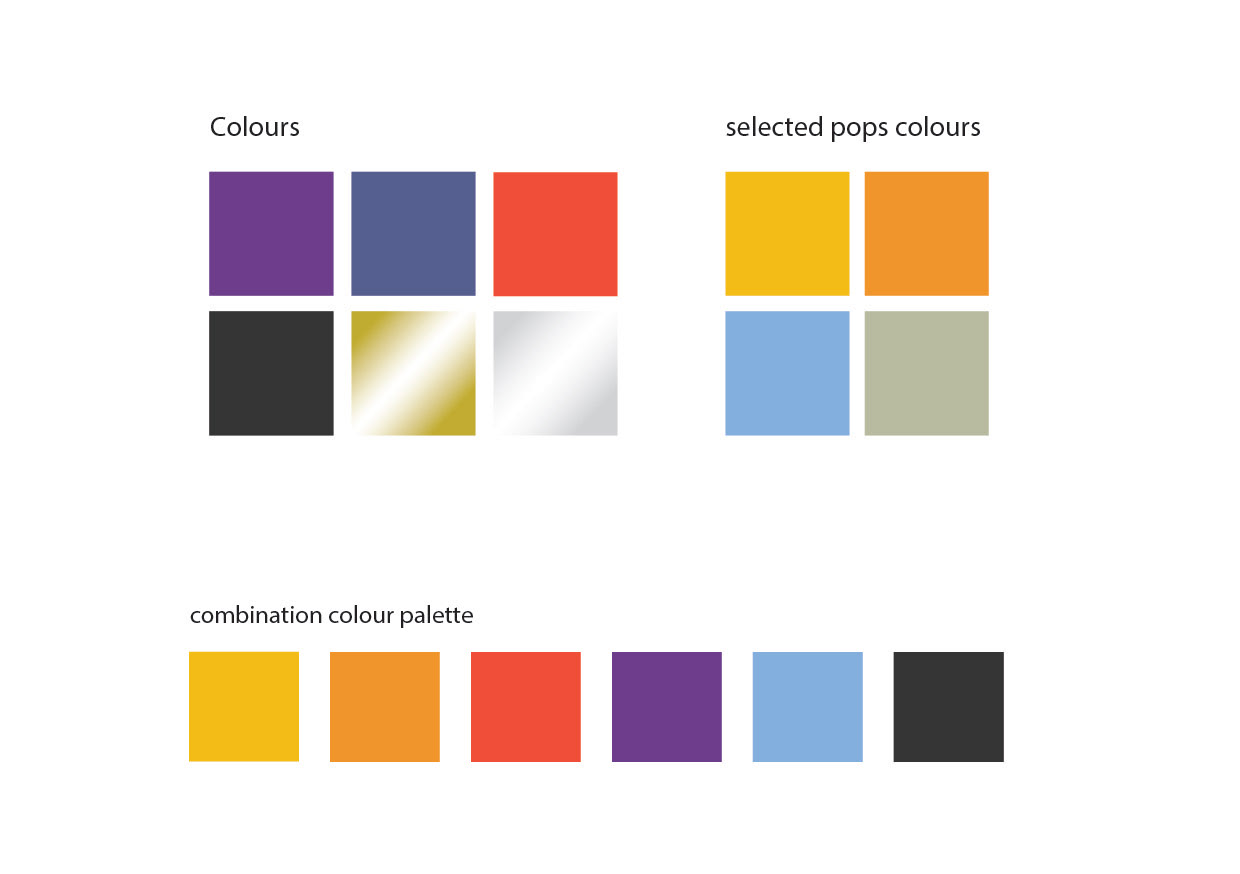
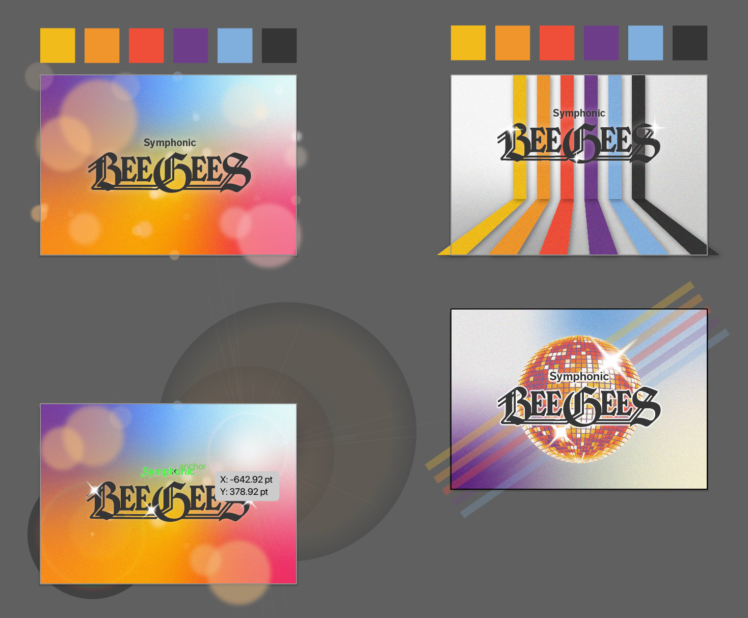
In this case, my client liked the combination colour palette and the more subtle disco imagery, not so keen on the bright patterns! They were happy with the style of fonts I had chosen and were fine to move forward and let me adjust them to fit with the BeeGees logo.
The chosen colour palette is a combination of popular 70s colours and colours from the BSO Pops brochure, which helped tie the concert artwork back into their overall branding.

Logo Design
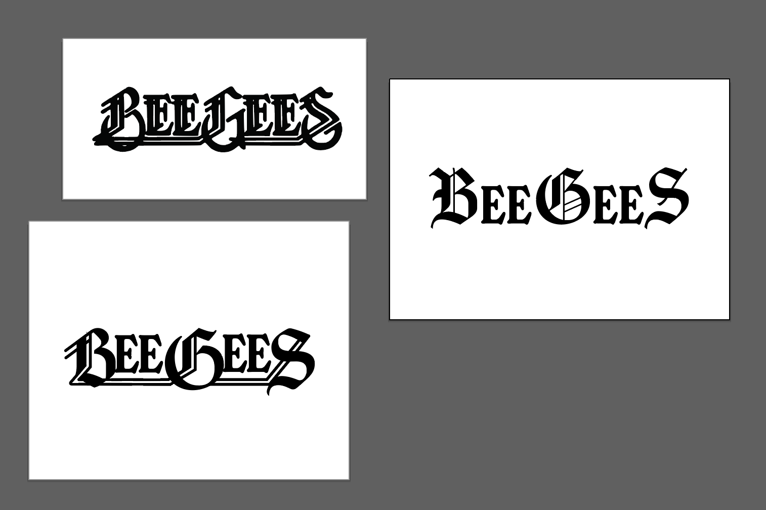
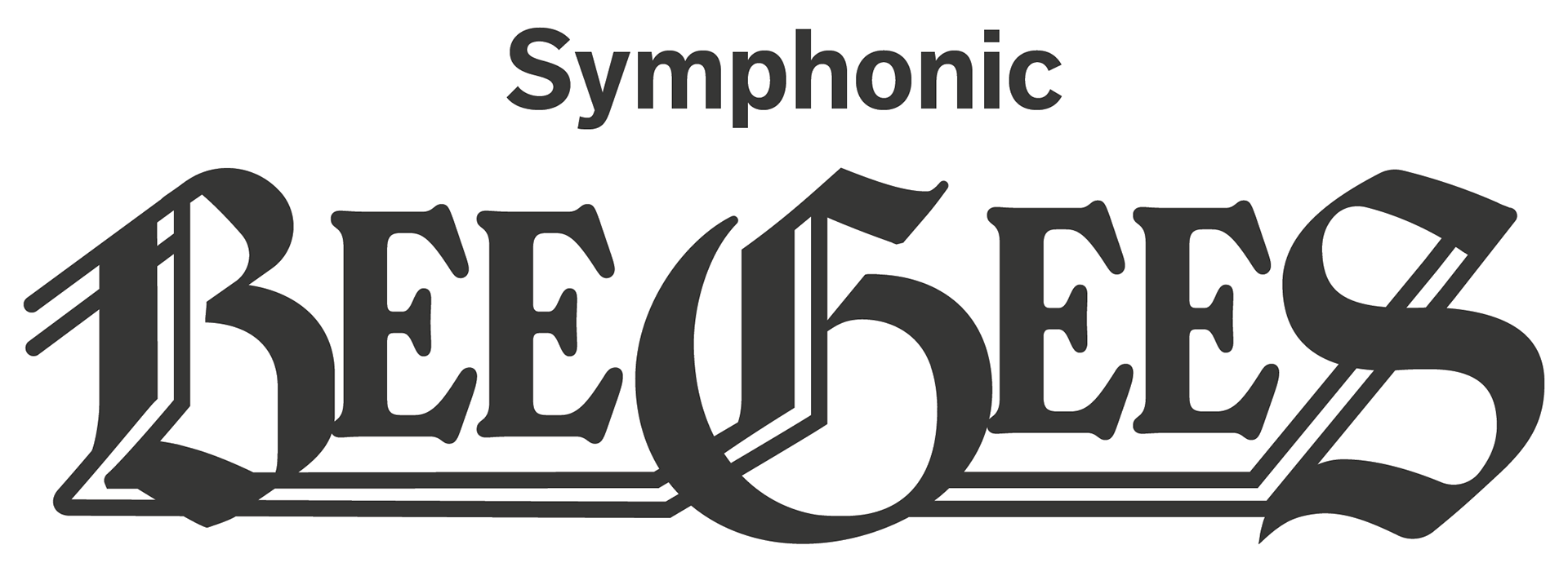
I used a combination of two typefaces to recreate the BeeGees logo, which had to be stylised due to copyright reasons. The final asset nods to the concept of the original logo, whilst remaining clean and legible.
Original logo - Top
Interpreted logo - Bottom
Initial Ideas
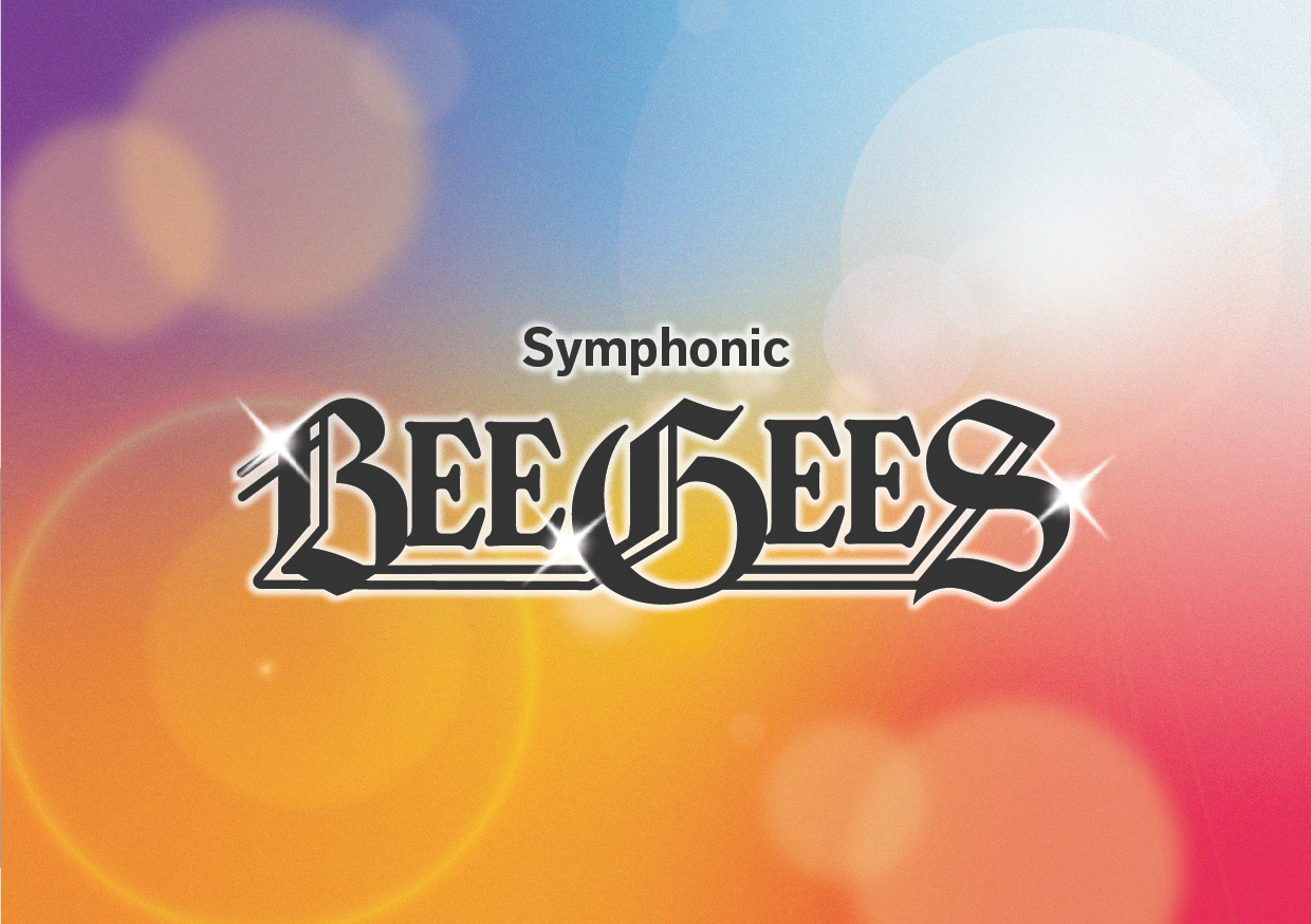
I then moved on to create 2 initial ideas based on the feedback I'd been given from the mood board.
Part of the requirements for this projects were that the artwork was adaptable for different marketing purposes, so I wanted to create a design with different elements that could be used individually or reshaped to fit what was needed.
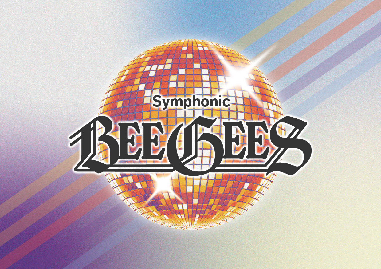
I kept these initial ideas relatively simple so I could develop them further as needed, rather than doing too much too soon and then the client not liking it. Luckily, my client really liked the second idea as is, so I didn't need to do anymore development!
I am really pleased with the final design. I think it reflects the BeeGees and disco era in cool, fun but understated way. In order to achieve this I used a combination of 70s design elements including stripes, disco ball/glitter imagery and the soft, glowy analogue photography style. I used a grainy freeform gradient for the background, a popular design element at the moment which reflects a cool, retro style, the grain removing the digital edge. Using the gradient allowed me to include darker colours without making the overall design too dark, and the soft transition between colours references disco lights and fuzzy imagery. The logo, disco ball, stripes and background can all be edited and reshaped to fit different purposes, and even be animated if required.