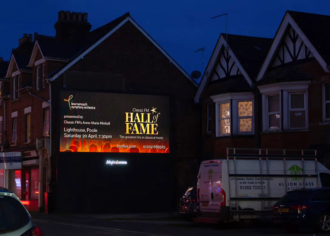
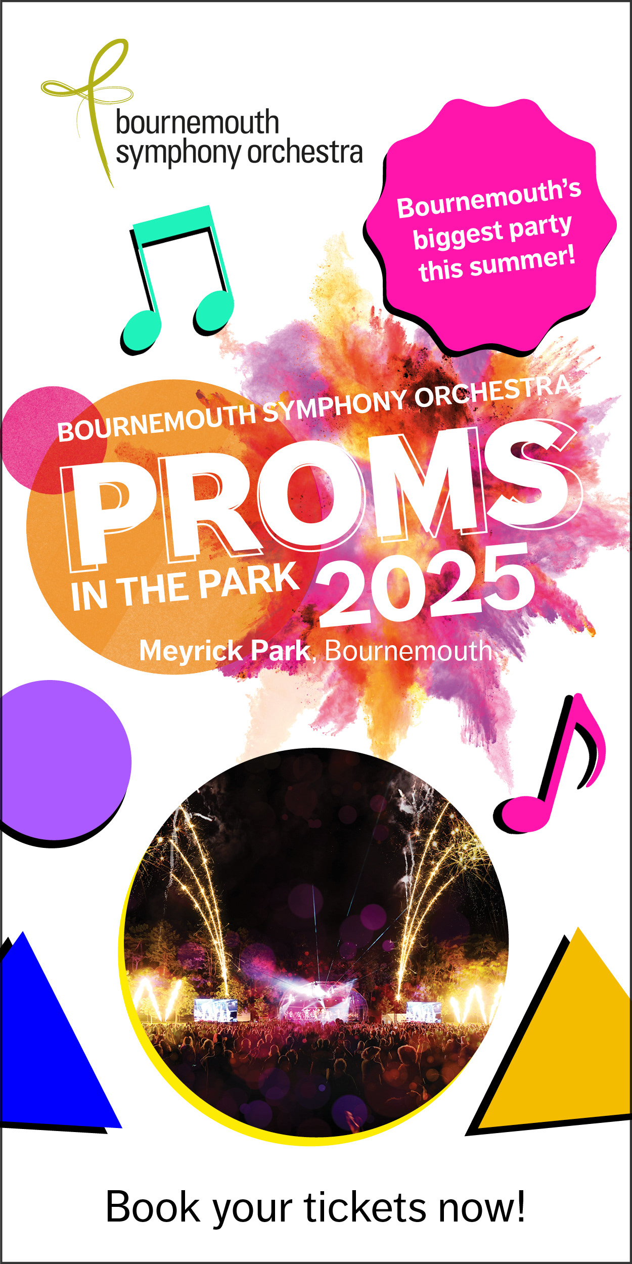
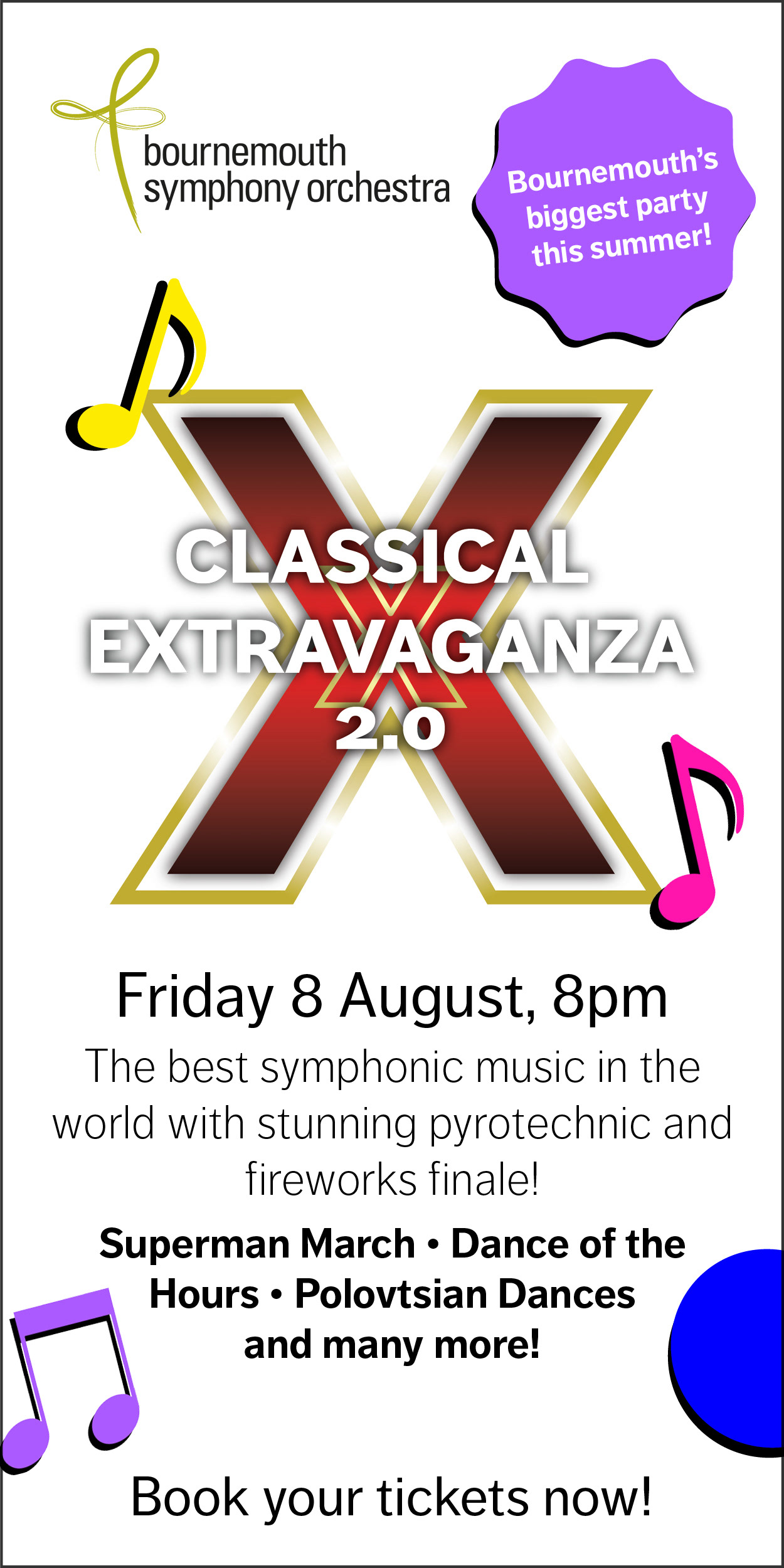
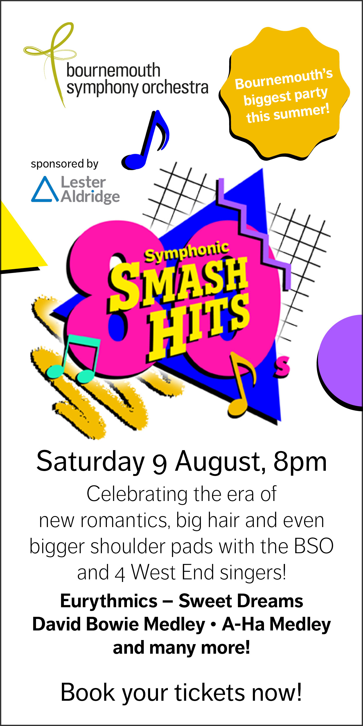
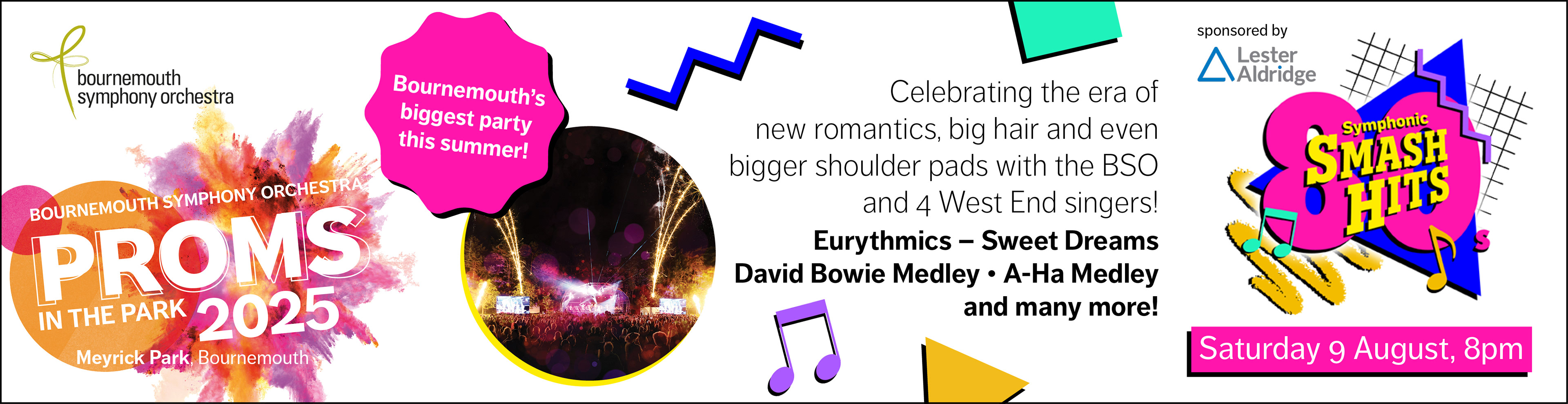
In 2025 I a large part in the creative marketing for BSO Proms in the Park, which was a great experience full of varied projects. Since January I was working hard designing a new identity for this years event, including another retro themed concert artwork and various marketing collateral.
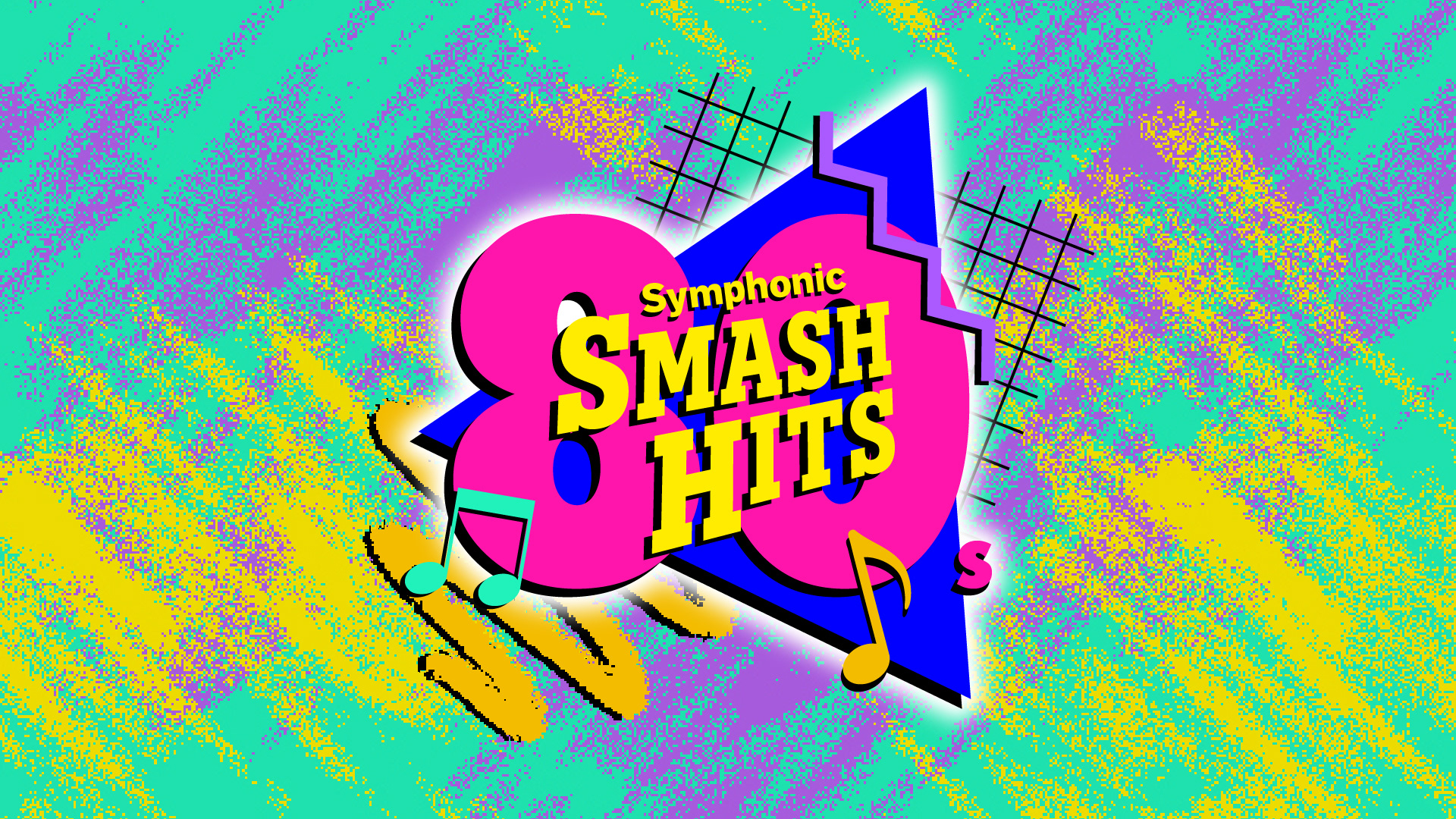
Symphonic Smash Hits - the 80s artwork
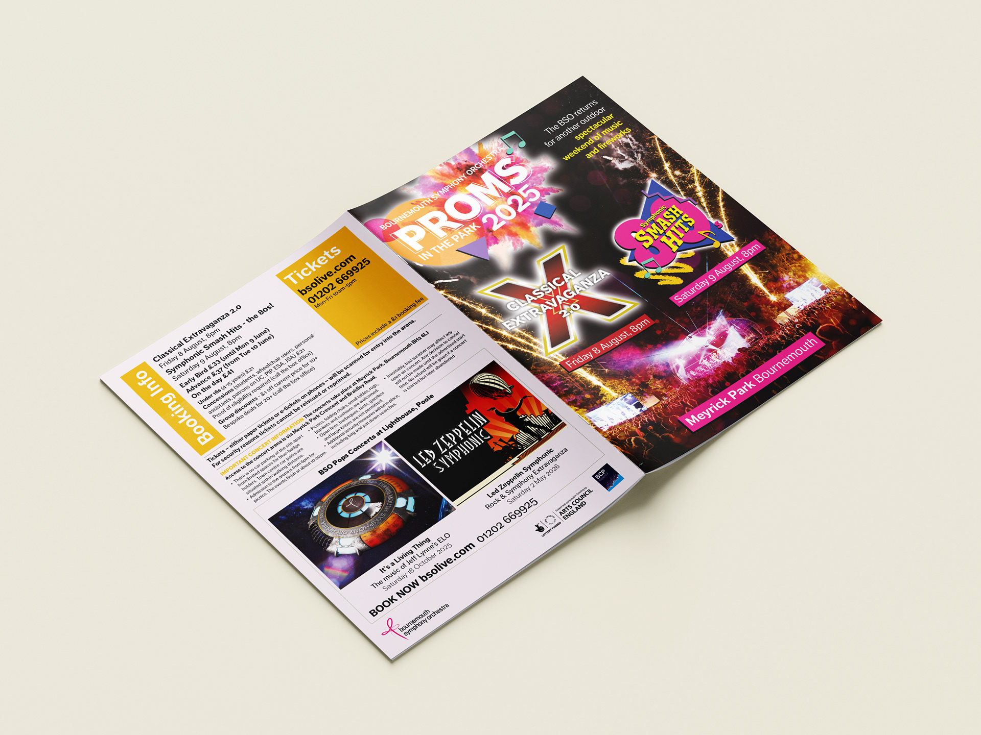
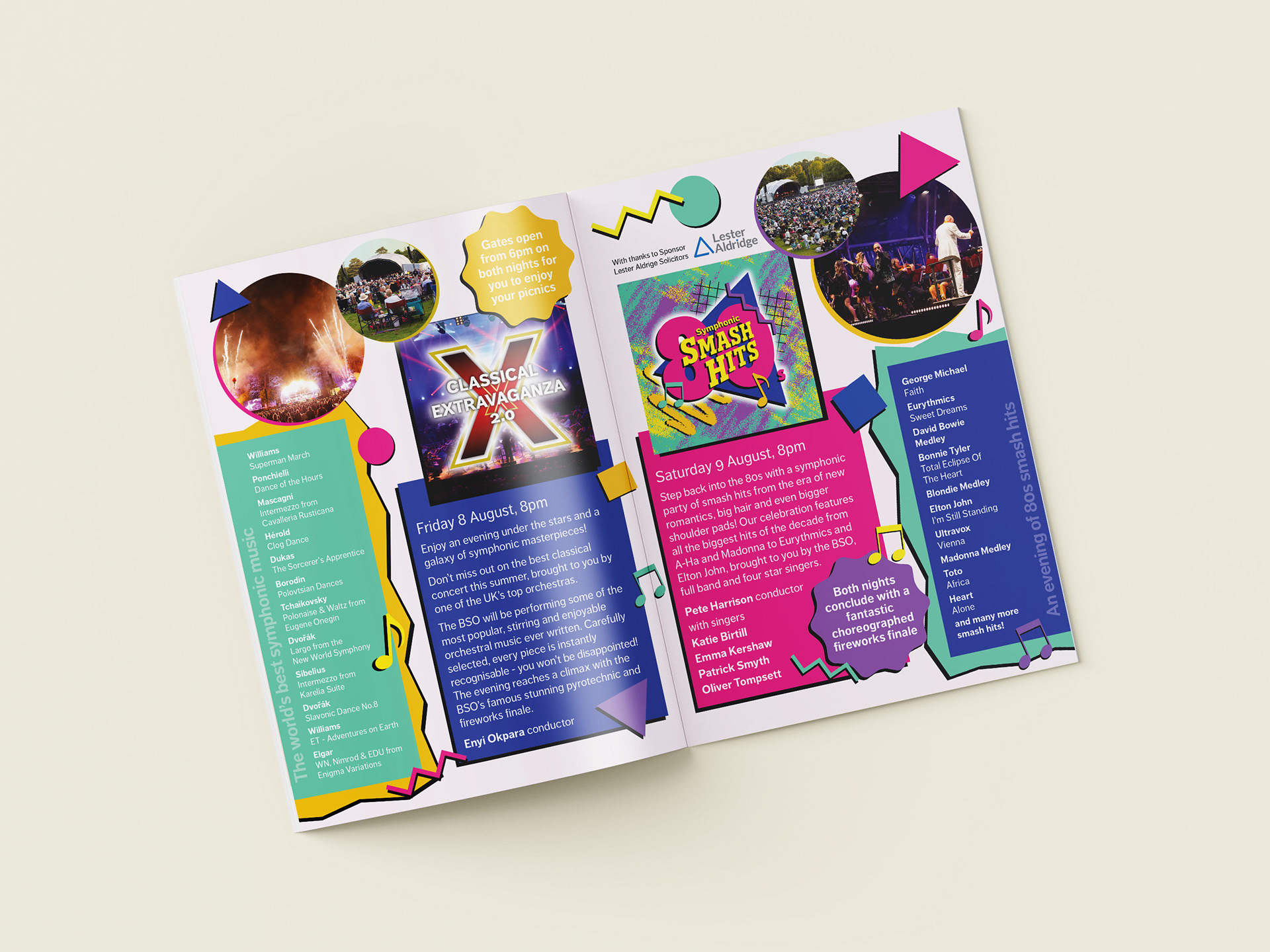
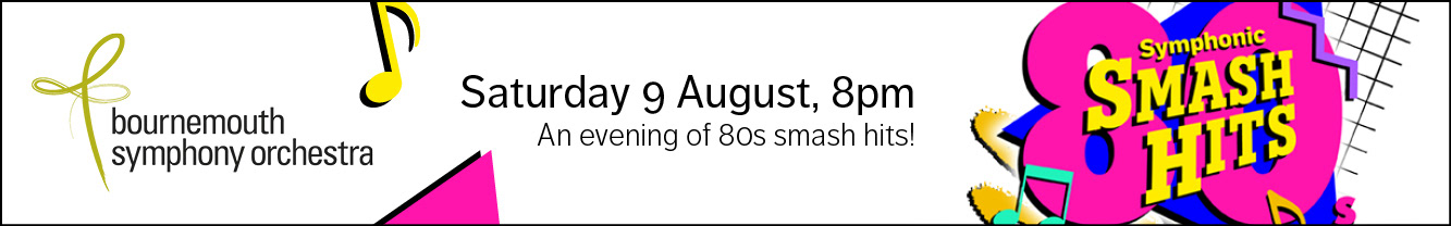
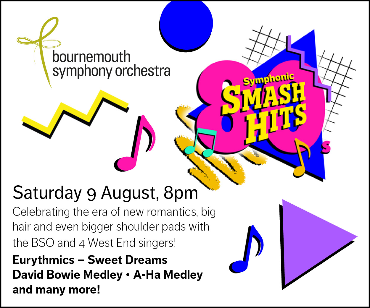
Print leaflet
GIF storyboard and resizes
Symphonic Smash Hits artwork design process
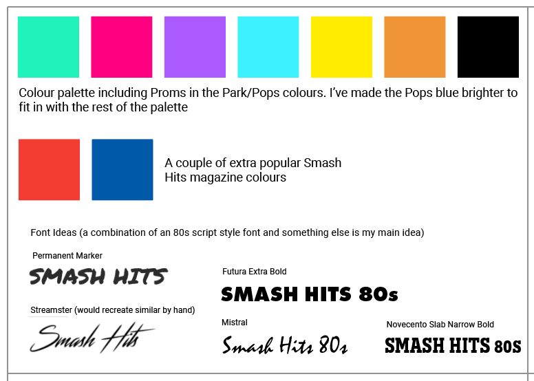
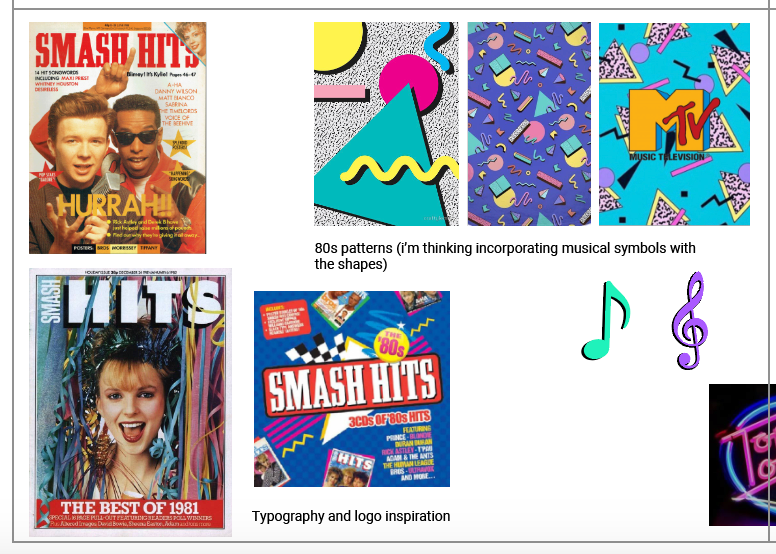
Moodboard
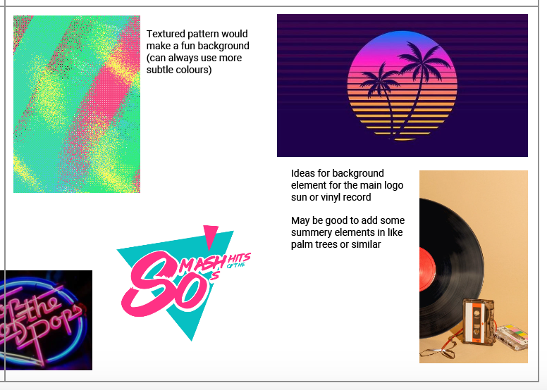
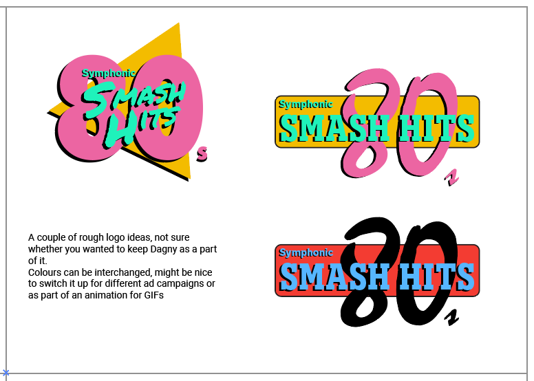
I started off by collating images, fonts, colours and elements that I could potentially use for the design, as well as coming up with a couple of rough ideas for the logo. I really liked the MTV blocky colour style, especially using the 80s neon colours. I chose a variety of 80s style fonts, some script with a vaporwave style and some inspired by music magazines and CD covers. My initial idea for the colour palette was a mixture of 80s neons with some jazzed up BSO Pops colours mixed in to keep it on brand. I liked the idea of using music notes and shapes as an element, as this was easily adaptable to every design output and with the added drop shadows looks very on style.
The feedback was to go all out 80s neons, with a textured/patterned background and the triangular style logo.
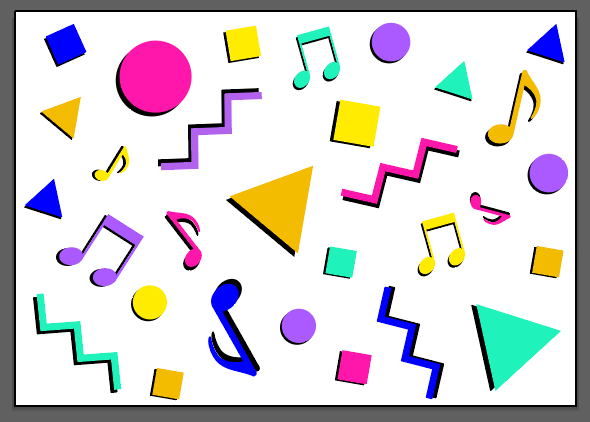

Initial ideas/pattern/colour palette
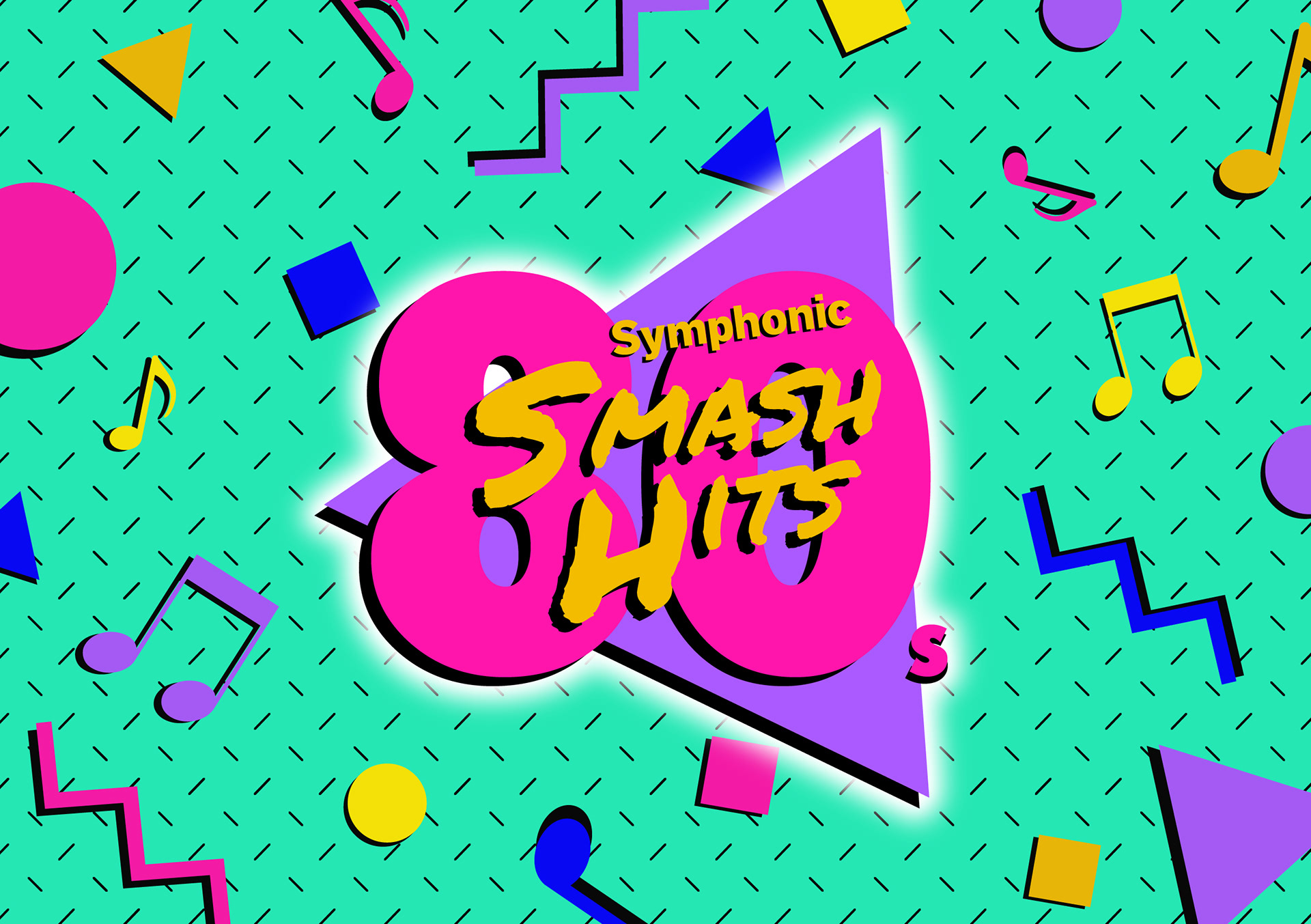
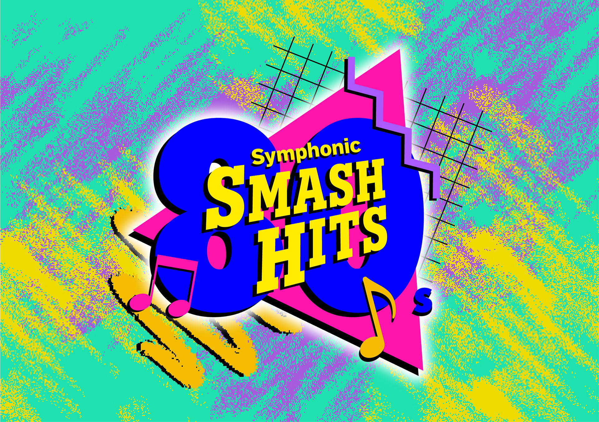
As with most of my artwork designs for BSO, I like to keep the logo element separable from the background so they can easily be rearranged or used individually. I tried 2 different backgrounds and a couple of different font/colour options for the logo. I also created a pattern design that could be used for assets if needed. Finally, I experimented further with the colour palette and settled on a variety of darker and light colours.
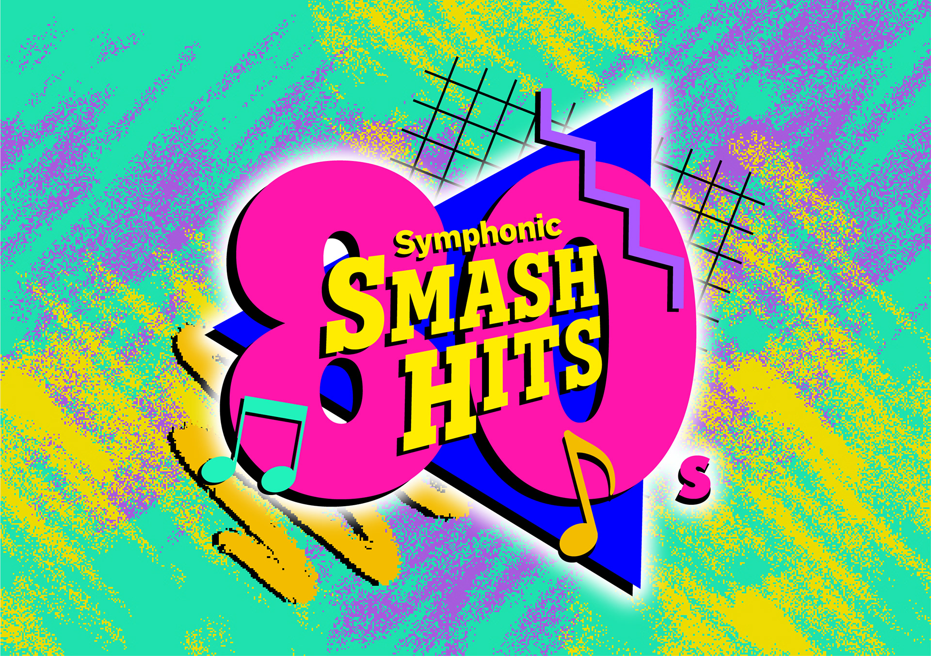
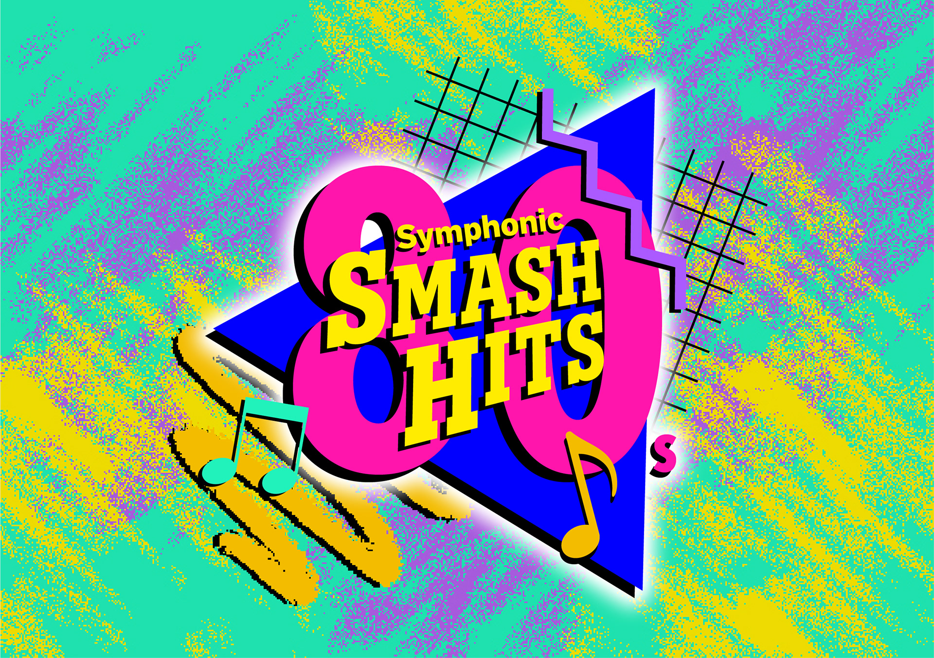
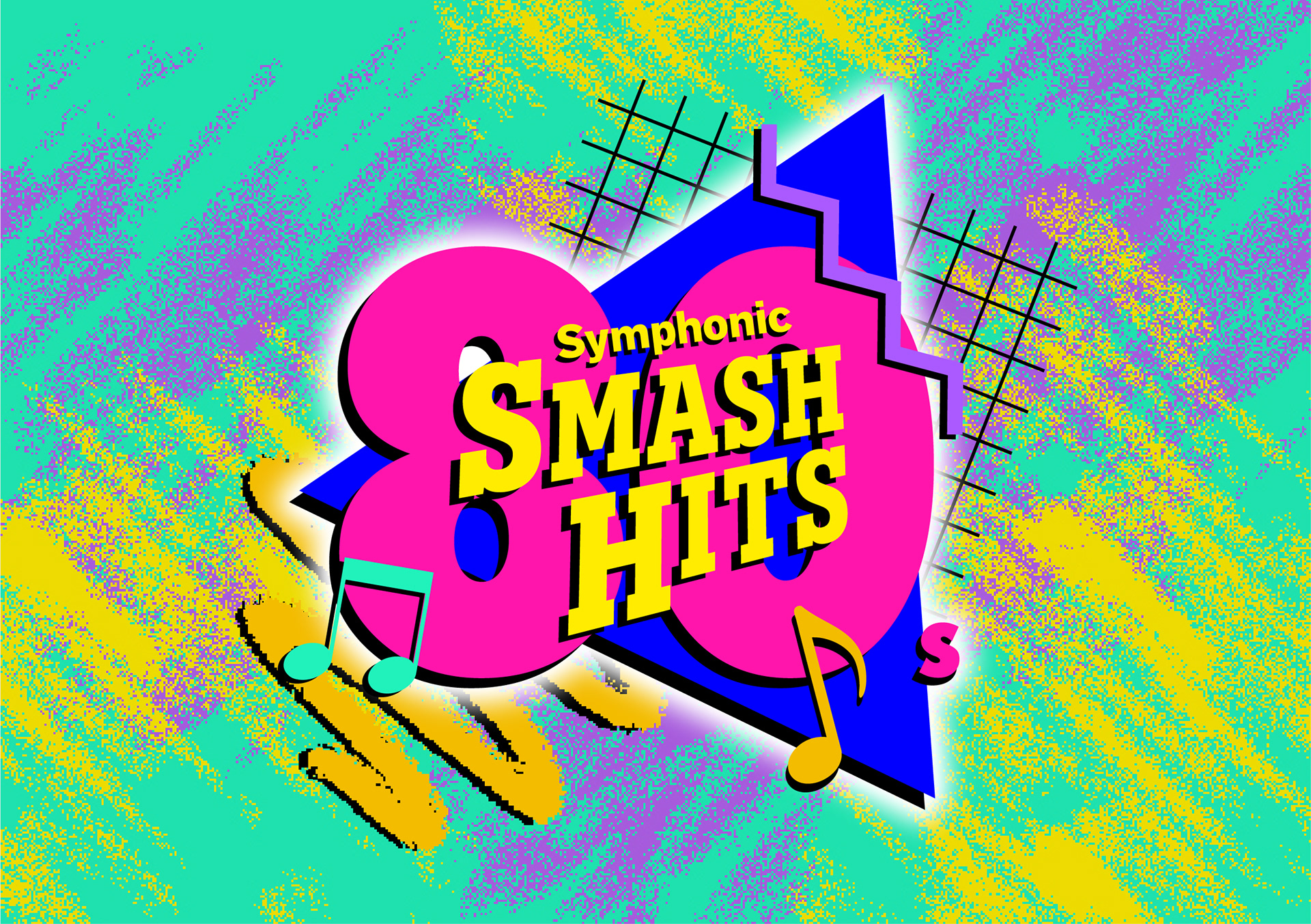
Idea development/final artwork
After a few last bits of experimentation with fonts and sizing the artwork was good to go!