The Skin Spa brief entailed designing packaging labels for a premium daily moisturiser, taking into consideration possible label materials and finishes that could be used to achieve a luxury look.
Packaging Labels and Mock Up
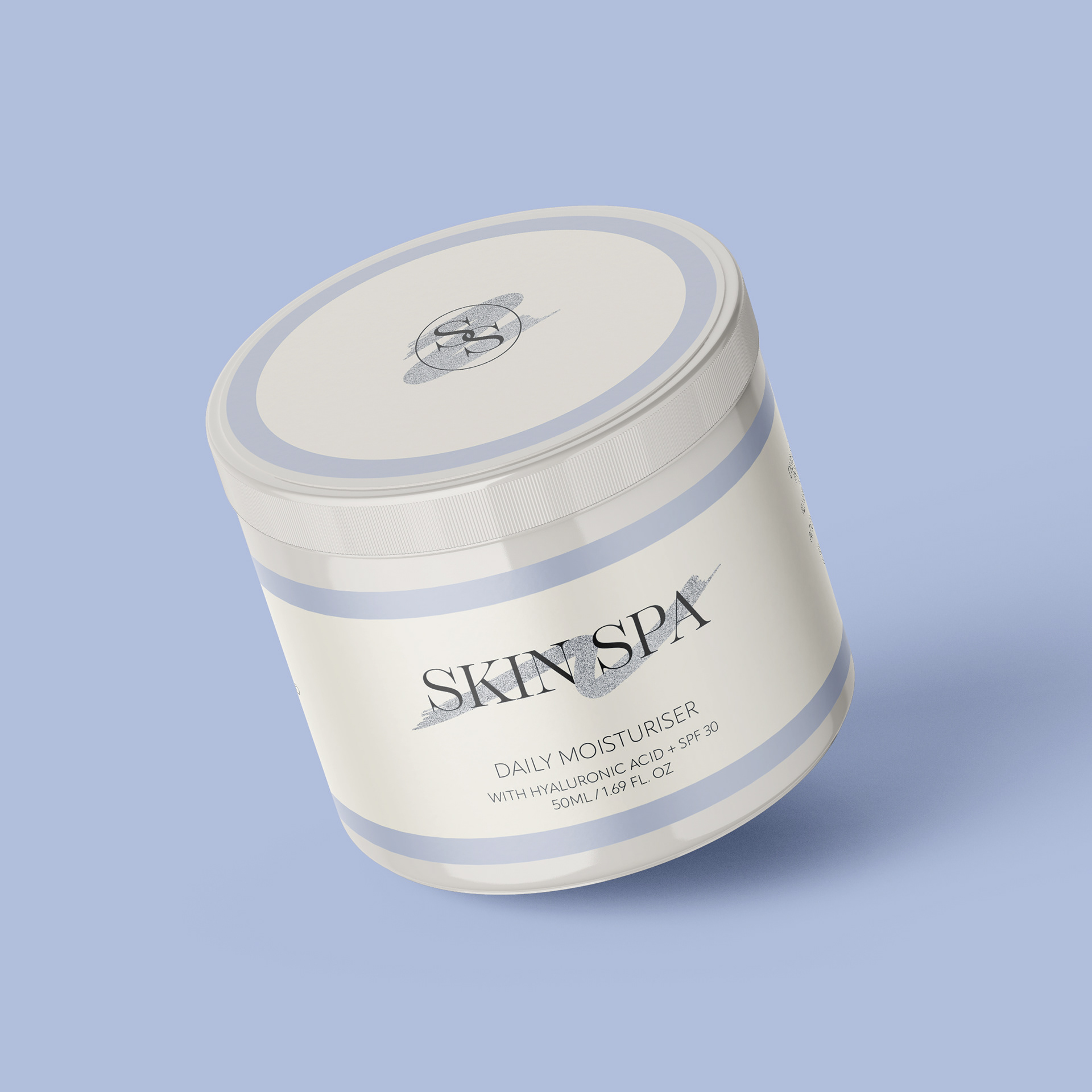

My aim with the Skin Spa project was to create a design with a light and relaxing feel. As the product is a daily moisturiser, I didn’t want the design to come across as being too intense. To achieve this I opted for a light colour palette: a blue accent colour to reflect water and hydration, and an off-white background colour to avoid the product feeling too clinical. For the main logo I chose a thin serif font to give the product a luxury feel, and for the rest of the text I chose a clean font that is legible at small sizes. On the label I have included the amount of product in ml and fl oz, a small description of the product, directions for use, ingredients and finally a PAO label. To add another element of luxury, I added a small brushstroke illustration on both labels that would be printed with silver foil and would stand out against the rest of the design, which would be printed on matte vinyl.
