Logo & Business Card
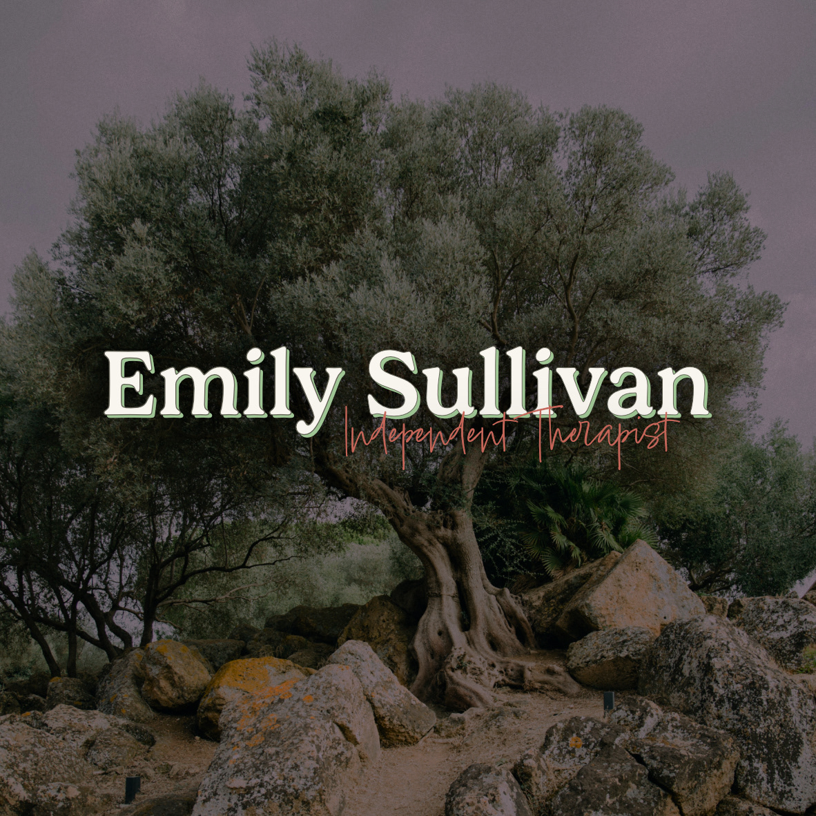
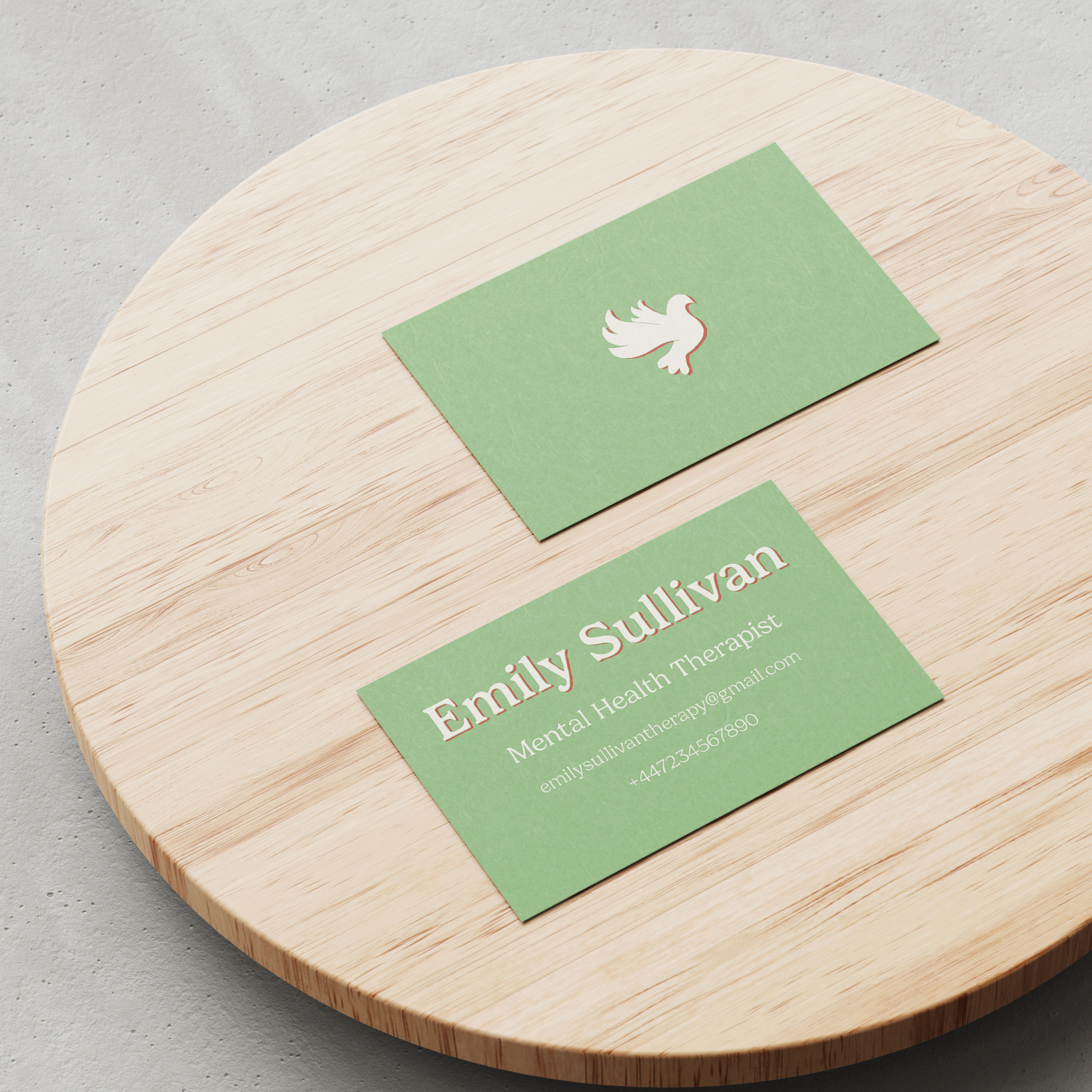
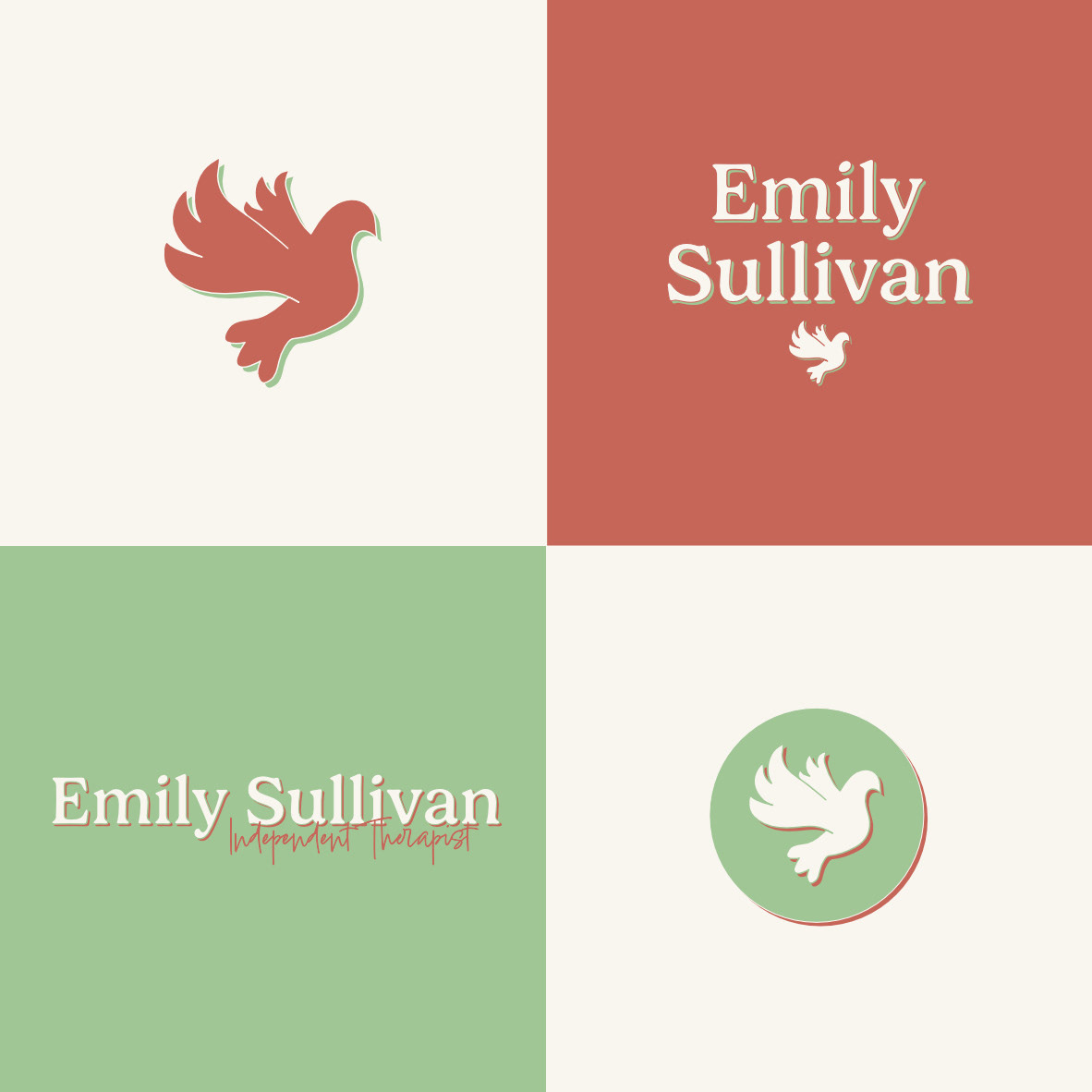
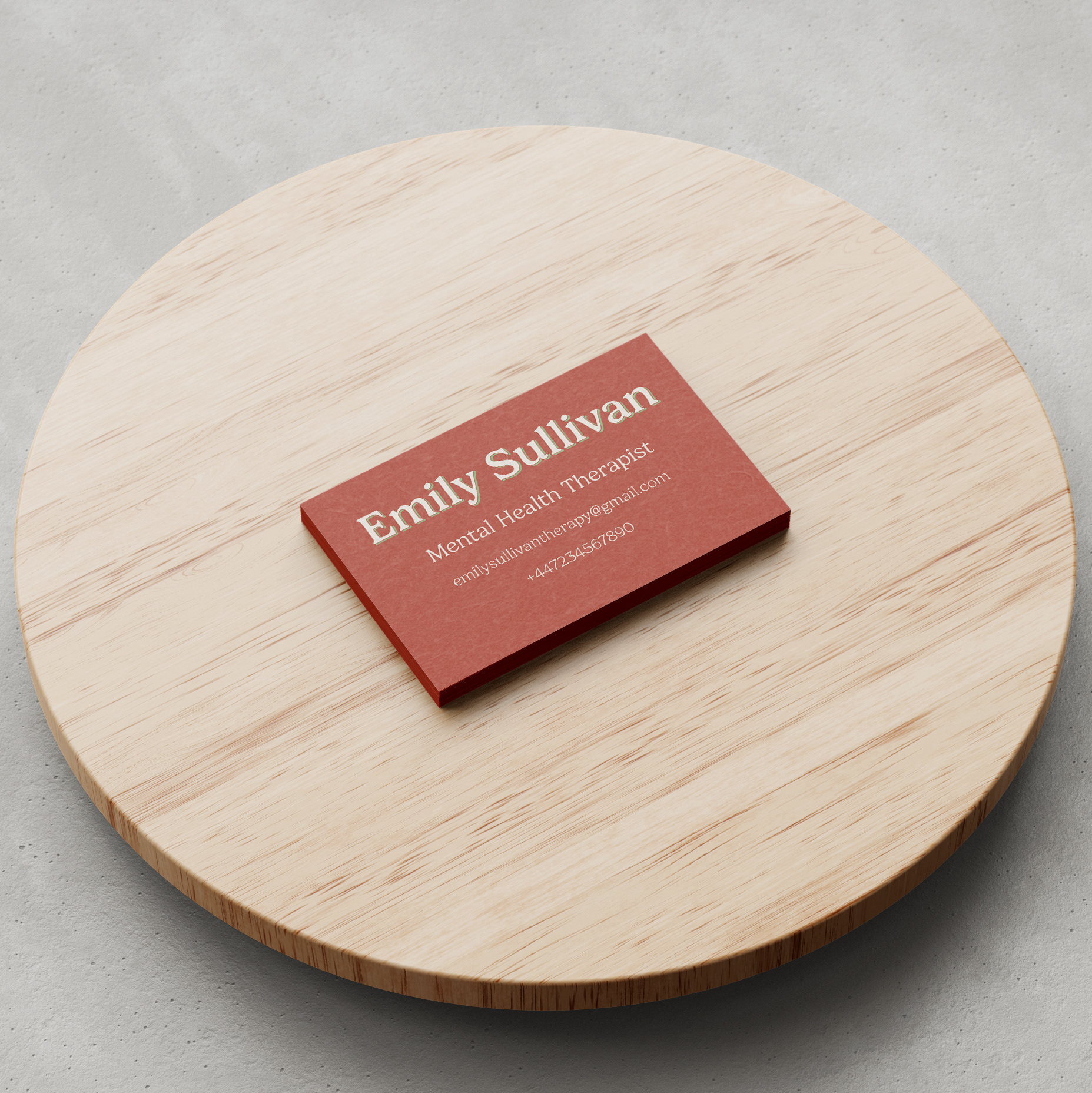
This project started out as a response to a brief set by a design prompt account on Instagram, but after finishing their required deliverables I decided to push the project further to exercise my designing muscles.
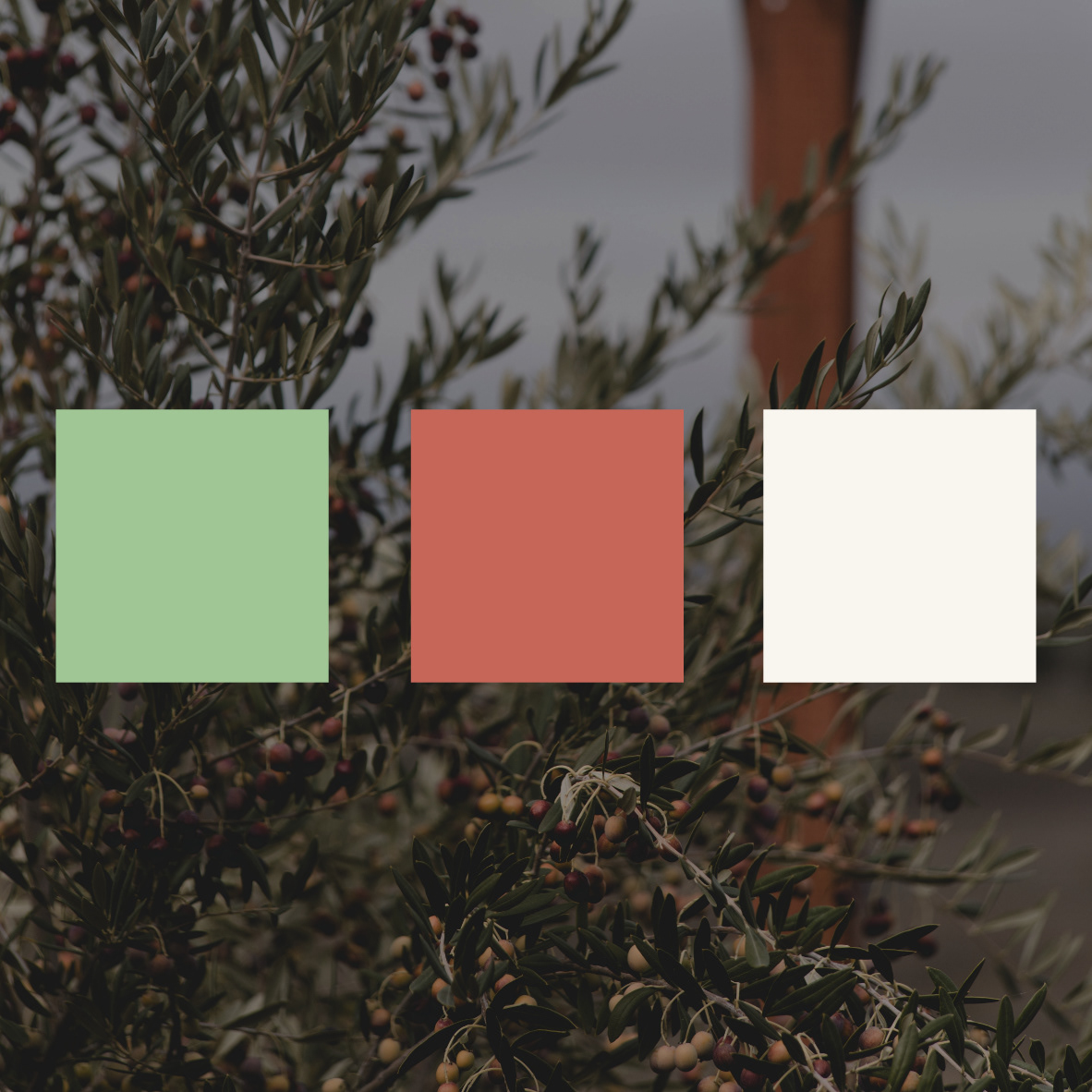
I went with the idea of the dove as a symbol for peace as the main characteristic of this project, as I felt it quite fitting with the notion of therapy and healing. From that also came the earthy colour palette, a muted olive green (a reference to the olive branch) and rusty red to create an almost grounding effect. I also wanted the palette and design on the whole to remain pretty gender neutral as to not put anyone off the idea of seeking help.
After designing the original logo and business cards I took the project one step further and designed a 2pp bi-fold information leaflet, which allowed me to practice layout design and setting type. (Pictures coming soon!)
